landinganalyze.com
Landing Page Analysis
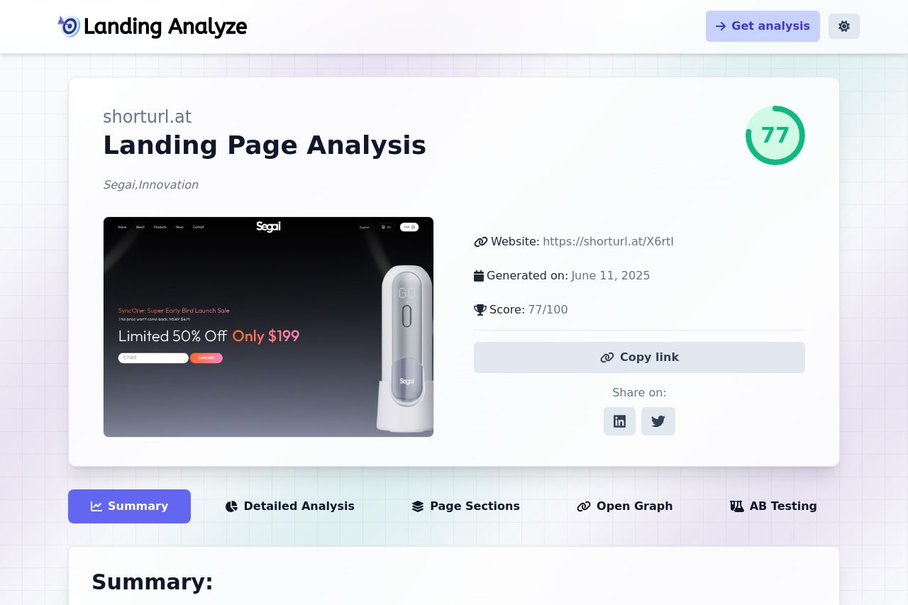
Discover the full analysis of shorturl.at, from copy to design, and use the tips to improve your own landing page.
Summary:
The landing page hits some high notes with its clear niche targeting and bold approach. The use of visually descriptive elements like "AI-Synchronized Video Masturbation" makes the value proposition stand out immediately, leaving a memorable impact. The design is sleek, but it's held back by overwhelming jargon like "360° Vibration," which might alienate the less tech-savvy. CTAs are practically invisible amongst all this noise, getting easily lost in the barrage of product features.
While the structure tries to maintain a logical flow, it can get bogged down in technical details. With a consistent color scheme, some text readability suffers against the dark background. Trust elements like badges and awards are a good start, but more could be done to bolster credibility with customer testimonials. Overall, it's a decent attempt, but needs refinement to align better with audience expectations and simplify messaging.
- Simplify technical language to make content more accessible.
- Enhance contrast and readability against the dark background.
- Strategically place and phrase CTAs to stand out better.
- Add more customer testimonials or case studies for credibility.