shorturl.at
Landing Page Analysis
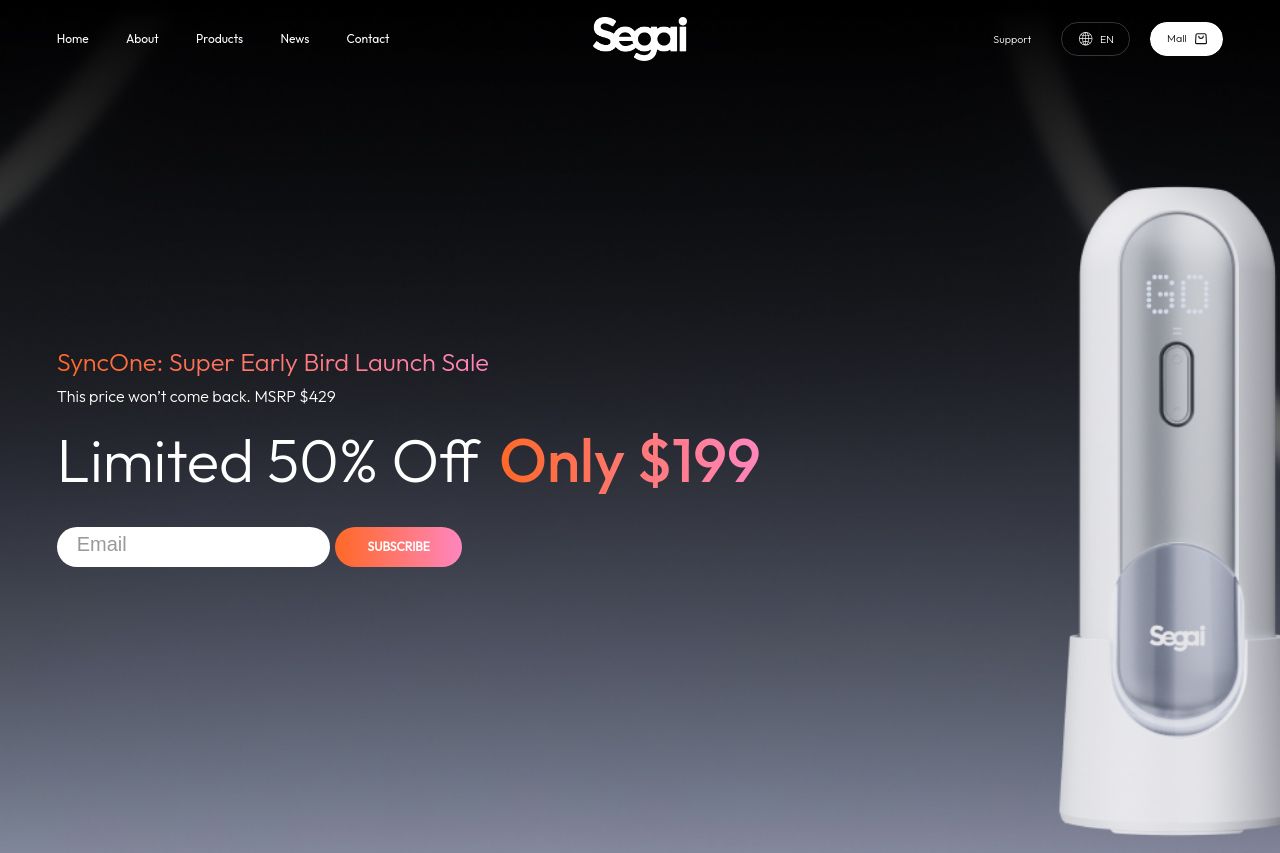
Segai,Innovation
Summary:
Segai's landing page presents a bold approach by diving straight into the specifics of its product, clearly targeting a niche market. The use of visuals and highlights like "AI-Synchronized Video Masturbation" immediately outlines the unique selling proposition. However, the abundance of jargon-heavy text like "360° Vibration" and "Multifunctional Base" can be overwhelming.
The overall design is sleek, with a consistent color scheme and typography, although some text can be hard to read against the dark background. Key details and examples are present to guide users through the features easily. However, the CTAs could be more compelling and strategically placed to capture attention amidst the extensive product information.
Despite the decent organization of content, the overwhelming amount of technical text could alienate less savvy users. Also, credibility elements like recognizable badges and awards create some trust, but additional customer testimonials wouldn't hurt to boost credibility further.
- Simplify the language to avoid alienating users less familiar with technical terms.
- Enhance CTA visibility and actionability by rephrasing for more impact, e.g., "Get Yours Now!" instead of "Subscribe."
- Increase customer trust by adding more testimonials or real-life user case studies.