gojiberry.ai
Landing Page Analysis
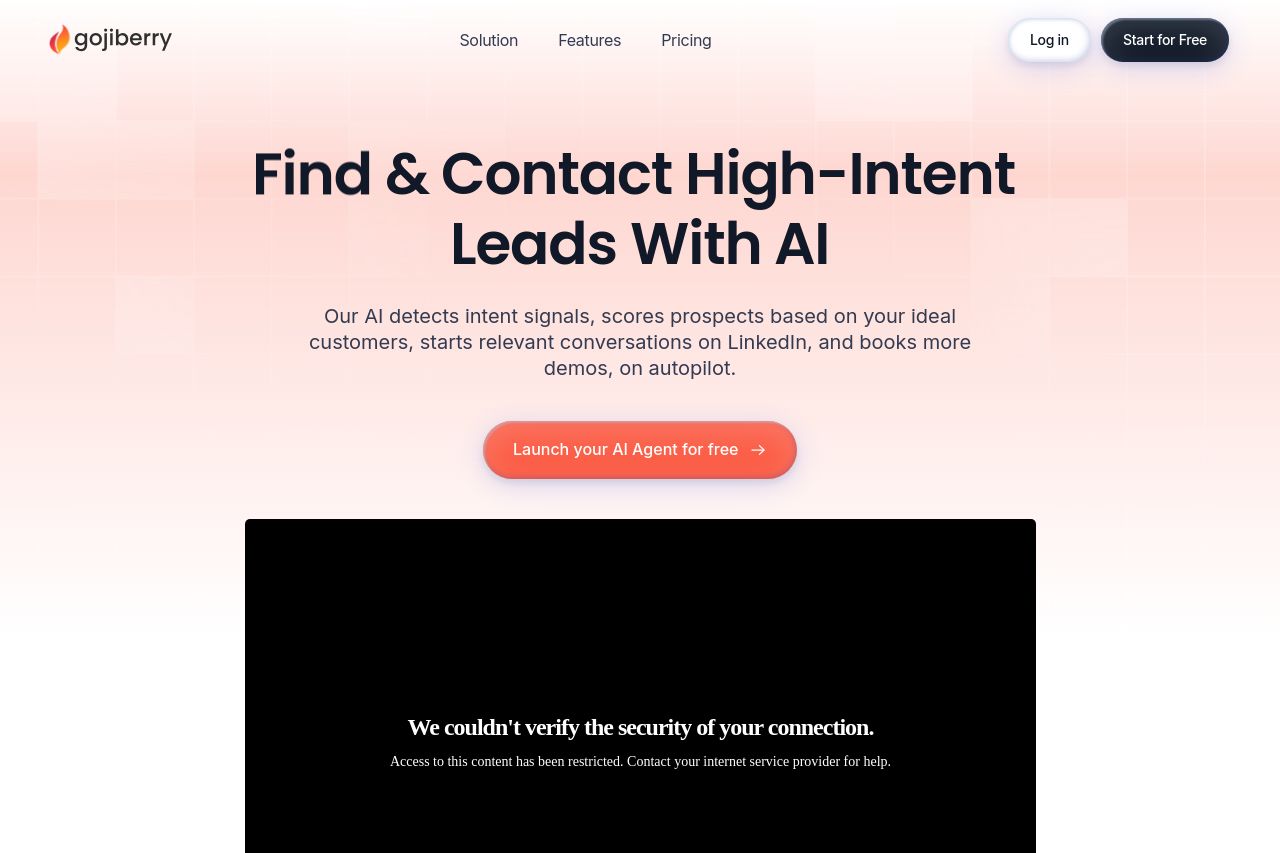
Gojiberry finds warm leads with 10+ intent signals like funding, new roles, events & groups. AI Agents filter by your ICP and run smart outreach campaigns, booking demos automatically while syncing w

Summary:
Open Graph data exists, but it’s not doing you any favors. The headline is descriptive but too long for social previews and will get truncated, killing impact. The description covers features, but it reads like a feature list rather than a persuasive hook. The attached image is great in theory, but without specifics on size, focal point, and alt text it won’t render cleanly on all platforms. Overall, OG is doing the minimum but not optimized for click-through or brand consistency. Also, there’s no mention of Twitter cards, which means you’re leaving potential engagement on the table when people share on X. You need sharper, platform-tailored metadata that aligns with the hero and the value you actually promise on the page.
- Shorten and sharpen the OG title to around 60 characters while keeping the core benefit visible, e.g. 'Gojiberry AI: Find warm, high‑intent leads fast'.
- Revise the OG description to a concise benefit-first line plus one differentiator, e.g. 'AI finds warm leads using 10+ signals and automates outreach for your ICP, syncing with Slack, HubSpot & Pipedrive'.
- Optimize the OG image: use 1200x630px with a clear focal point and brand elements; add descriptive alt text like 'Gojiberry AI dashboard showing warm leads automation'.
- Add Twitter card metadata (twitter:card, twitter:title, twitter:description, twitter:image) and ensure it mirrors the OG data for consistency across platforms.