finalytics.agency
Landing Page Analysis
Finalytics - Professional ad performance analytics and audit platform
Summary:
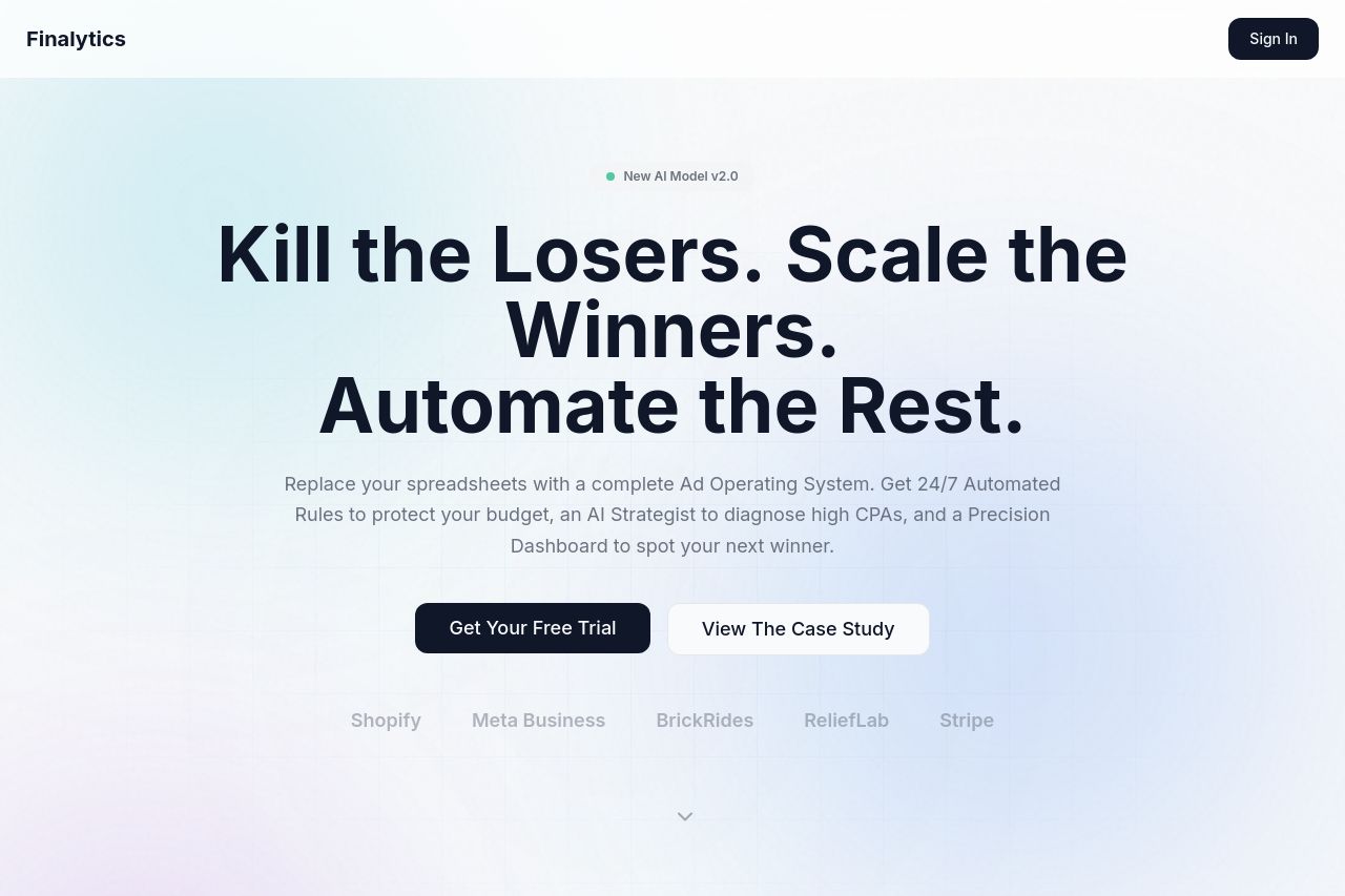
Overall vibe: punchy, bold, and visually polished. The hero is hard to ignore and the two CTAs are there, which is good for action. But for a B2B Meta Ads audience, the value prop isn’t crystal clear fast enough and some claims sound hype-y rather than tangible. The rest of the page looks clean, but the flow into features, case studies, and pricing isn’t tight or scannable at first glance. Trust signals exist but feel underutilized (logos are faint, testimonials blurred). If you want to convert serious ad teams, you need clearer demonstrations, concrete use cases, and stronger, scannable ROI proofs early on.
The OG data currently reads as generic branding without a killer visual or messaging hook for social shares. No standout company visuals, no immediate value proposition in the image, and the description could be more actionable. The image attached is a simple silhouette and doesn’t reinforce the platform’s benefit to advertisers. Consider a social-optimized graphic that shows ROI, a quick stat, or a recognizable brand badge to improve click-through.
- Clarify the core value prop in 1 line under the hero (e.g., "An AI-powered Ad Operating System to automate and optimize Meta & multi-channel campaigns in real time.")
- Make the hero copy more benefit-focused (show a tangible outcome, not only bold verbs).
- Strengthen trust signals above the fold (customer logos, stats, or a 1-liner testimonial).
- Replace or enhance the OG image with a 1200x630, branded asset that communicates ROI or platform capability, and add explicit OG text (title + description) that mirrors the on-site value proposition.