cohen.law
Landing Page Analysis
Cohen Injury Law Group helps Los Angeles injury victims after car, truck, and pedestrian accidents. Call today for a free consultation!
0
Share on:
Summary:
0
Messaging
0
Readability
0
Structure
0
Actionability
0
Design
0
Credibility
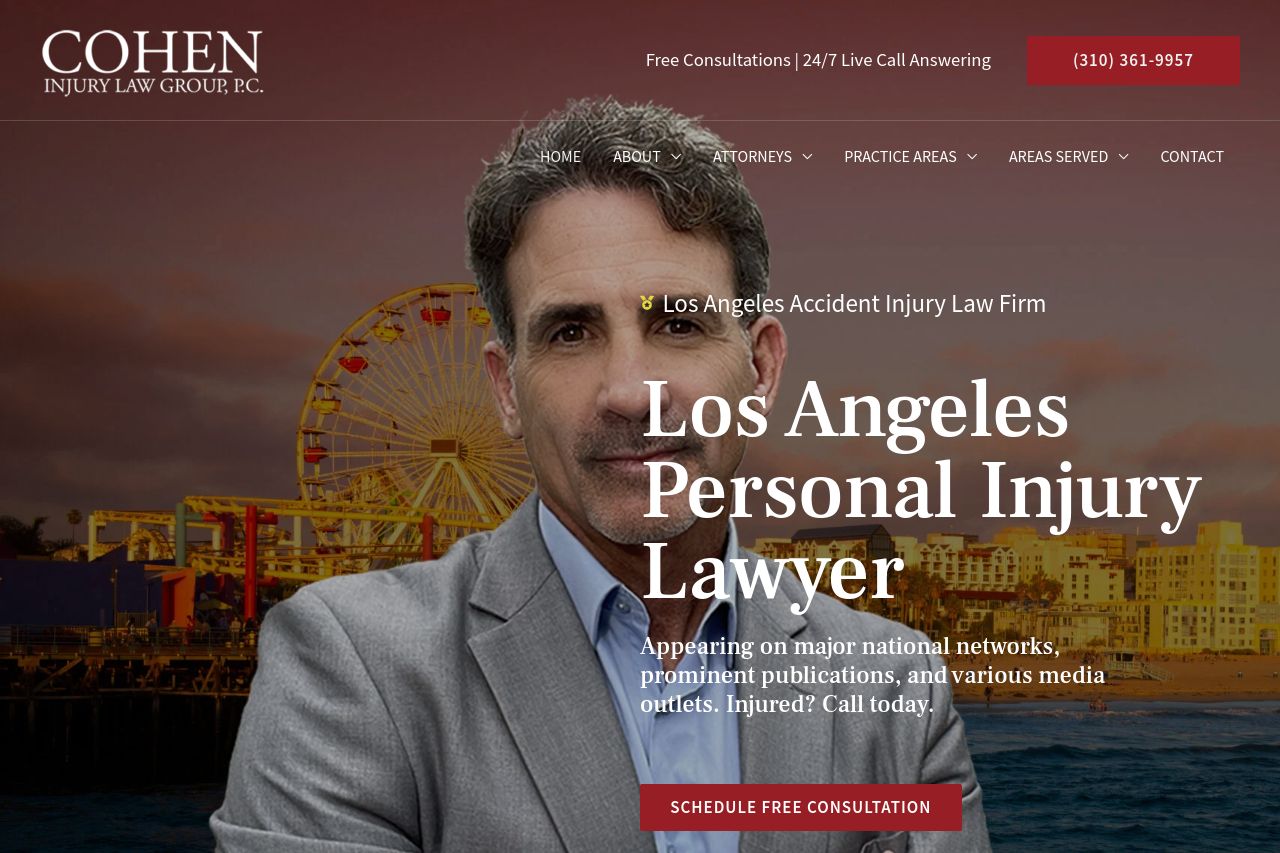
The landing page looks premium but it’s shouting with text, not clarity. Above the fold you get a strong hero image, but the headline stack and dense body copy bury the core value proposition. Navigation is busy and the CTA is not visually dominant enough to stop a scroll. The lower sections try to build credibility with lists and “learn more,” but the overall information architecture feels sprawling and hard to quickly scan. You need a tighter value proposition, clearer hierarchy, and chunkier, more scannable blocks to keep visitors from bouncing before they even reach the read-more sections.
Main Recommendations:
- Cut the hero copy to a single, crystal-clear value proposition above the fold and pair it with a bold CTA.
- Introduce a stronger visual hierarchy with more whitespace, bigger headings, and shorter paragraphs to improve scannability.
- Simplify navigation and create clearly distinguishable sections (trust, practice areas, FAQs) to reduce cognitive load and guide the user toward the main CTA.