testimly.com
Landing Page Analysis
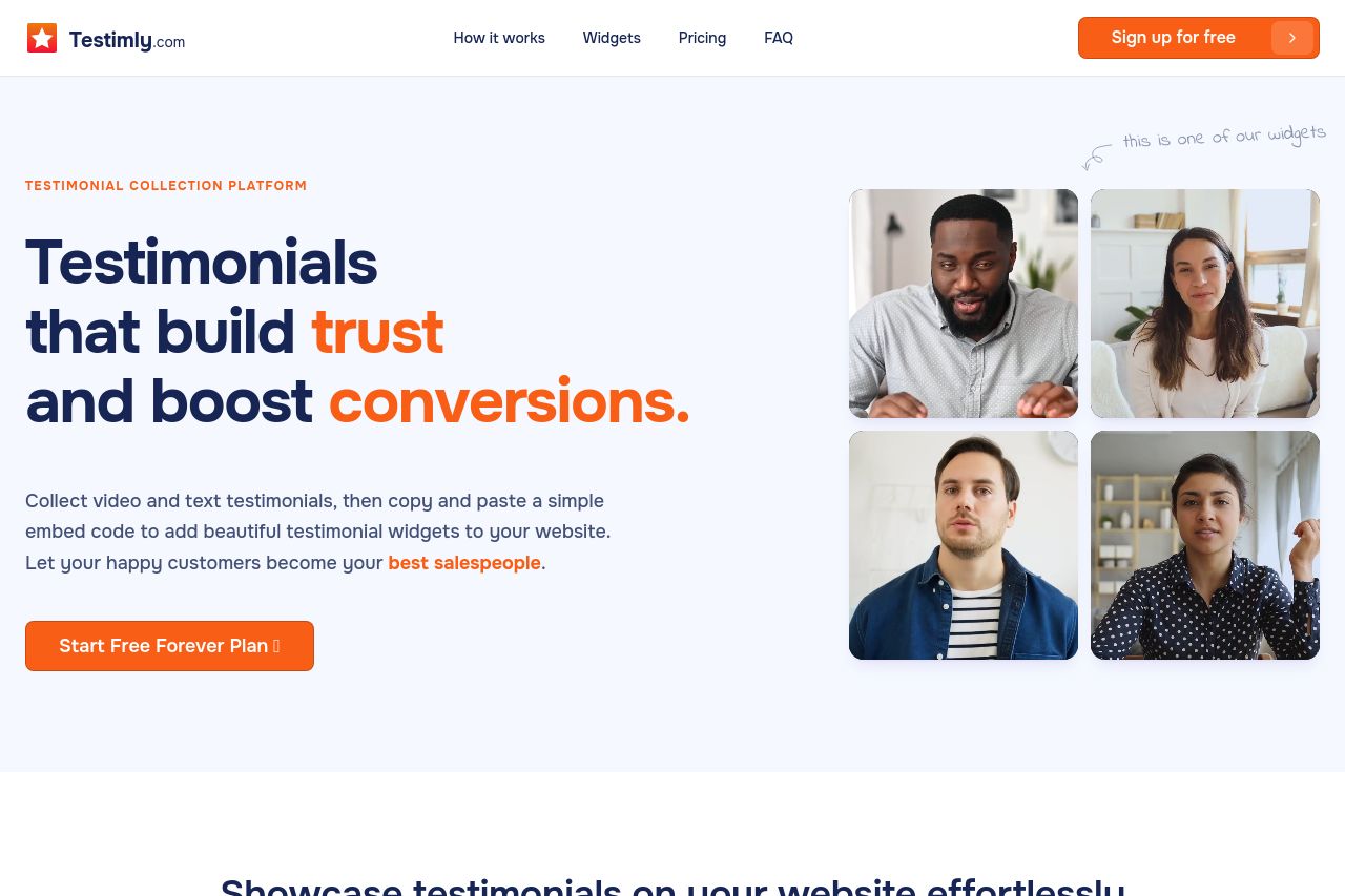
Collect video and text testimonials effortlessly. Build trust, boost conversions, and showcase authentic customer feedback with Testimly.
Summary:
The page is visually bold and friendly, with big, confident typography and a warm orange CTA that feels actionable. The header navigation and hero area establish the product proposition quickly, and the widget collage on the right reinforces the testimonial angle. Where it stumbles is in information density and mobile rhythm: sections feel heavy, some blocks compete for attention, and there isn’t a single, unmistakable primary action above the fold. The pricing/plan details are buried deeper in the funnel, and the FAQ/comparison blocks risk overwhelming users who just want to know what they get and how much it costs. Overall, it’s friendly and on-brand, but the layout could tighten the fold, clarify the value in fewer words, and improve mobile readability and trust signals.
Bold, high-contrast typography and a clear CTA are positives, but the page would benefit from crisper hierarchy, stronger focus on the hero’s core benefit, and more scannable blocks that lead users toward pricing and a demo or signup without needless scrolling.
- Reduce hero copy length for mobile and ensure the primary CTA is the only prominent action above the fold.
- Consolidate the hero visuals to reduce cognitive load – consider a cleaner right-side collage or a single, strong visual instead of multiple rounded thumbnails.
- Improve trust signals near the hero (e.g., a small row of logos/testimonials, quick stat like ‘X customers’ or ‘Y% lift’) and add a concise pricing teaser within the fold.