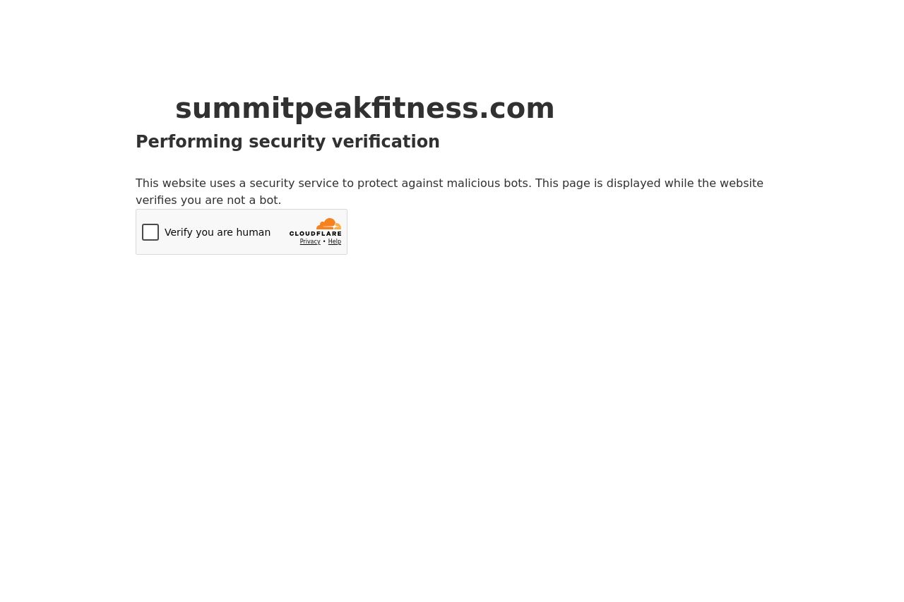
summitpeakfitness.com
Landing Page Analysis
This website uses a security service to protect against malicious bots. This page is displayed while the website verifies you are not a bot.

Summary:
This isn't a landing page at all, it’s a security interstitial. It hangs the user on a Cloudflare check instead of selling your fitness program. The copy is generic, brandless, and doesn’t speak to men 35–55 who are your target. There’s no clear value proposition, no audience-specific tone, and no path forward beyond “verify you’re not a bot.” The visual is minimal to the point of forgettable, which might be fast, but it also feels like a barrier that kills trust. In short: terrible first impression, zero marketing intent, and a usability drag.
The upside is that it’s simple and fast-loading and clearly communicates that something is happening (security check), but that payoff is negligibly valuable when your page experience is this cut off and anonymous.
If you want this to convert, you need brand continuity, audience relevance, and a smoother transition back into the funnel. Right now it’s a roadblock that makes you look untrustworthy or incomplete.
- Brand the verification screen with your logo, colors, and a one-sentence reassurance on why this check is happening (e.g., "We protect your fitness journey from bots—one quick check and you’re back to Summit Peak Fitness").
- Replace the generic captcha widget with a branded, accessible verification experience or a privacy-friendly alternative that reduces friction while maintaining security.
- Add a clear CTA after verification (e.g., "Continue to Summit Peak Fitness" with a strong verb and prominent styling) and a short note about what happens next.
- Include trust signals and essential policies (privacy, terms) and a visible way to contact support if the user runs into problems.
- Increase accessibility and clarity by providing alt text for any widgets, ensuring keyboard navigation, and avoiding ambiguous language.