doctorhippo.in
Landing Page Analysis
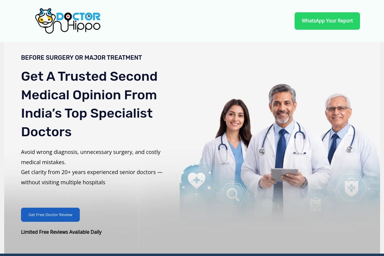
Avoid wrong diagnosis, unnecessary surgery, and costly medical mistakes.Get clarity from 20+ years experienced senior doctors — without visiting multiple

Summary:
Open Graph is the one place you can stop the scroll. Right now the data is barely adequate and could actively hurt clicks if someone spots it in a feed. The title is readable and relevant to the service, but it’s pushing the practical length limit and risks getting truncated on smaller previews. The description tries to sell clarity from veteran doctors, but it’s tacked onto a brittle line break (it ends with an incomplete sentence in the copy you provided), which reads sloppy. The image you’ve attached (logo-heavy) may not read well at a glance in social cards and probably won’t convey the key benefit visually. You’re missing essential OG metadata like og:url, og:type, and safe alt text for accessibility. In short: fine, but forgettable. You can and should do better to guarantee clicks from social channels.
- Trim the OG title to around 60 characters for clean display in feeds (e.g., “Trusted Second Medical Opinion from India’s Top Doctors”).
- Rewrite the OG description into a single, crisp sentence under 160 characters (end with a period): “Avoid wrong diagnoses, unnecessary surgeries, and costly mistakes. Get clarity from 20+ years of senior doctors—without visiting multiple hospitals.”
- Use a branded OG image sized for social (1200x630 or 1.91:1) that clearly communicates Second Opinion + Doctor Hippo, with accessible alt text and a concise visual hook. Also add og:url and og:type (website) and, if possible, a Twitter card tag.