getbaddies.com
Landing Page Analysis
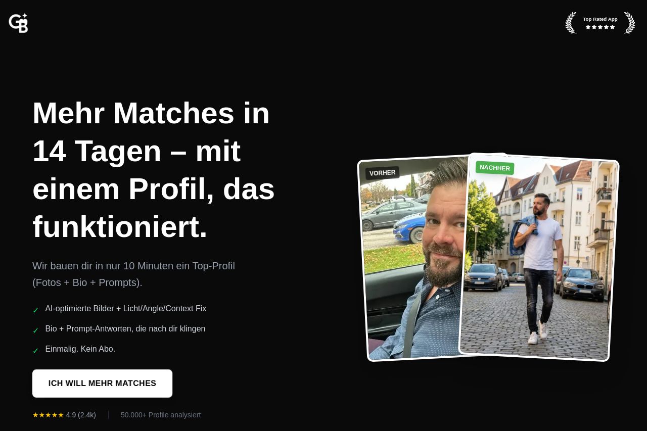
Egal ob du gar keine Matches oder nur Ghosting bekommst – dein Problem sind nicht du, sondern deine Fotos. Wir analysieren >50.000 Profile für deinen Erfolg. 73% verdoppeln Matches in 14 Tagen.
Summary:
This landing page looks premium, but the message savagely fights itself. A brutal black-on-black aesthetic with enormous type sells boldness, yet the Open Graph data behind social shares is a disaster waiting to happen: no image, only a vague title and a performance claim that sounds more hype than proof. The on-site copy phủses between “Mehr Matches in 14 Tagen” and the promise of “ein Top-Profil” built in minutes, which creates cognitive dissonance and trust issues. The social proof is sprinkled in, but nothing on the OG side backs it up when someone shares the link. The hierarchy is dense but unclear: big hero, some bullet-style wins, a three-step flow, FAQs, testimonials, and then a single CTA that tries to corral all intent into one action. It’s visually striking, but the messaging coherence is weak and the meta/OG setup undermines click-through potential before a user even lands on the page.**
- Fix Open Graph: add a high-contrast, emotionally compelling OG image and align OG title/description with the on-site value proposition to ensure consistent messaging when shared.
- Unify the hero copy with the OG messaging. Choose a single, credible promise (e.g., "Endlich mehr Matches in 14 Tagen – mit einem Profil, das wirklich funktioniert") and remove conflicting lines like 10-minute profile claims.
- Add social proof that can be graphed or quantified on-site (real averages, case studies, logos) and surface pricing or risk reversal early to reduce skepticism.