alsaffir.shop
Landing Page Analysis
30,000د.ع
Summary:
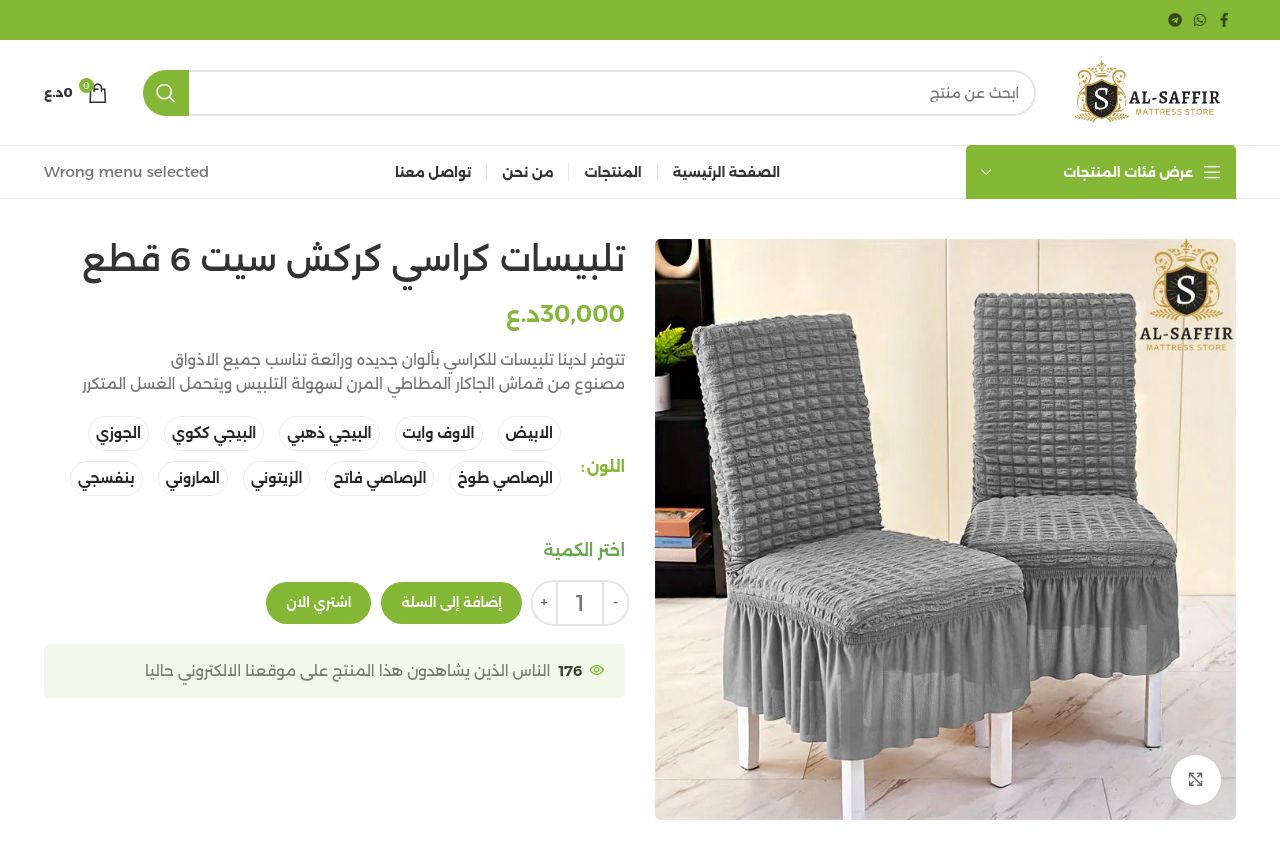
Clear enough product visuals and a strong green brand accent, but the page drops the ball on telling visitors why they should buy now. the hero headline merely states the product name and price, with little to no explicit benefit or use-case. there’s a prominent right-side image that dominates the screen, which helps—yet the copy around it doesn’t translate that visual into tangible value (durable fabric, easy care, etc.). a weird “Wrong menu selected” line above the navigation chips away at credibility and makes the page feel unfinished. the color palette and CTA styling are consistent, but the page lacks critical trust signals (reviews, shipping/return specifics, guarantees) and crowd-sourced proof (only a generic “people viewing this” line is visible). overall, it looks clean and functional, but it’s not persuasive enough to convert without a stronger value proposition, audience-specific messaging, and explicit buyer reassurance.
To improve: tighten the value proposition, add a concrete benefit line (e.g., “protects chairs, easy to wash, fits 6 chairs”), tailor copy to a clear audience, add trust elements (reviews, policy links), and fix any navigation/UI oddities that break flow.
- Rewrite the hero to include a clear benefit statement and a subhead that mentions durability, ease of washing, and fit for 6 chairs (e.g., “Premium chair covers for 6 chairs – durable fabric, machine washable, quick install”).
- Move the primary CTA above the fold or immediately beneath the hero when possible, featuring a single, action-oriented label (e.g., “إضافة إلى السلة”) with a strong contrast.
- Remove or correct the stray “Wrong menu selected” line and ensure the navigation is immediately usable to avoid credibility damage.
- Add explicit product specs and value props next to the image (fabric type, care instructions, dimensions, compatibility) so benefits are scannable.
- Include at least 1-2 customer testimonials or trust badges (policy links, return window, and contact details).