axisrooms.com
Landing Page Analysis
Unlock more direct bookings and boost revenue with AxisRooms’ hotel web booking engine. Automated, mobile-friendly, and perfect for B2B hoteliers in India. Get Better Support & Better Pricing.
Summary:
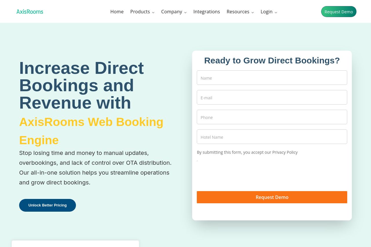
Strong concept, weak execution. The Open Graph data promises a India-focused, automated, mobile-friendly hotel web booking engine that increases direct bookings and revenue while offering better support and pricing. On the live page, the hero nails the big ideas but doesn’t shout the India focus or the automation angle loudly enough. The headline sells the benefit, but the subtext and visuals don’t aggressively reinforce the automation and B2B-specific storytelling. There’s a lot of whitespace and a clean palette, which is good, but the page Overlays/Cookie panel and multiple CTAs steal attention from the primary action. The layout looks solid, yet there’s a real risk of friction: a dense hero area, a right-side demo form that competes with the CTA, and a FAQ section that feels tacked on rather than integrated into the journey. If you want better performance, tighten audience-specific messaging, surface proof earlier, and declutter CTAs to guide users to a single, unavoidable action.
- Explicitly call out India and B2B hoteliers in the hero/subhead to lock onto the target audience from scroll one.
- Shift emphasis to automation and managed/enterprise benefits in subheads and bullet points, not just the promise of direct bookings.
- Reduce on-screen CTAs and avoid stacking overlapping CTAs (primary CTA vs. form CTA). Use one clear primary action per screen/view and place it where the user is most likely to convert.