axisrooms.com
Landing Page Analysis
We value your privacy
Summary:
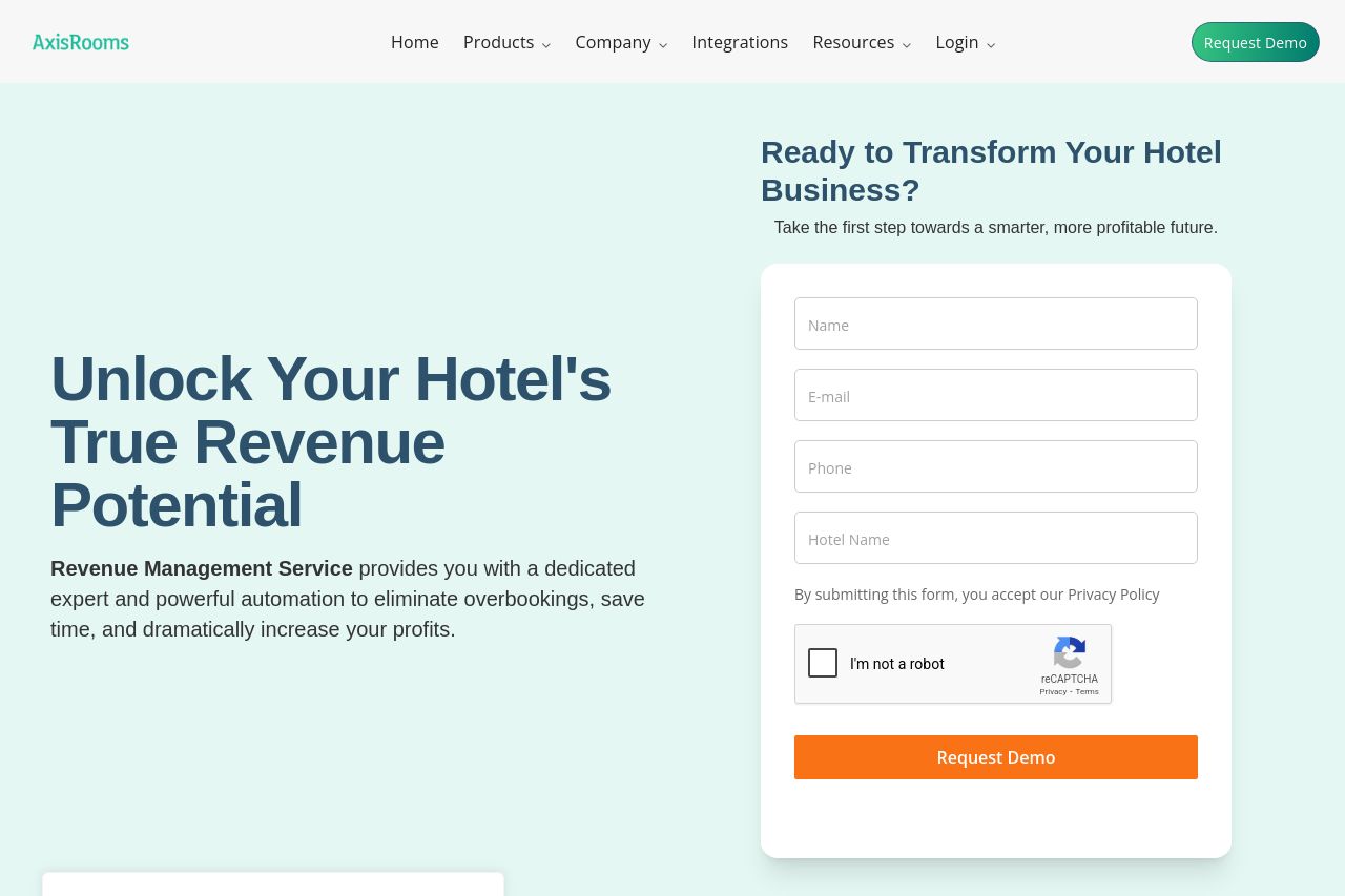
Bold promise in the hero, but the copy barely sells how it actually helps hotels stay profitable. The left-aligned giant headline is dramatic, but the subcopy beneath it is generic and vague about what the service actually does. The right panel form looks like a demo capture, which is fine, but it competes with the hero copy for attention and readability. Visuals are clean and pastel, which works for trust, yet the cookie modal and chat widget sit on top and break flow. The trust proof is inconsistent: there are customer quotes, but the layout never clearly ties them to real, named brands or outcomes. Overall, the page looks polished, but the messaging hardens into generic marketing speak rather than a crisp, outcome-focused value proposition. The page also understates pricing or exact deliverables, which creates friction for decision-making. It’s visually pleasant, but the content needs sharper clarity, tighter hierarchy, and less friction in the conversion path.
Key friction points: unclear primary value proposition for whom, overuse of overlays that distract, and a lack of concrete, scannable benefits or use cases. A few sections do good work (clean typography, strong hero emphasis), but they get lost in a sea of similar-looking cards and testimonials that don’t feel fully credible. A few obvious wins: unify the CTA experience, present a real customer outcome early, and reduce visual noise around cookies and chat widgets.
In short: the design is solid, the tone is professional, but the messaging and conversion hooks are under-optimized. You need a sharper promise, clearer audience targeting, and a frictionless path to a demo.
- Clarify the primary value prop in one crisp sentence that states who benefits and what outcome they get (e.g., "We automate hotel revenue optimization to grow ADR and occupancy without the overhead"). Replace or augment the current headline with a short, benefit-led subhead that follows the main headline.
- Unify CTAs and reduce clutter around forms: place a single, prominent primary CTA (Request Demo) near the hero and after key sections, ensure the button contrasts well, and avoid multiple different CTAs that confuse users.
- Cut or defer cookie/chat overlays that obscure critical content. Move consent and chat widgets to a less intrusive position or require interaction only after the user scrolls past the hero so early content remains readable.