axisrooms.com
Landing Page Analysis
We value your privacy

Summary:
AxisRooms Channel Manager landing is visually bold and confident, but it trips over its own clutter.
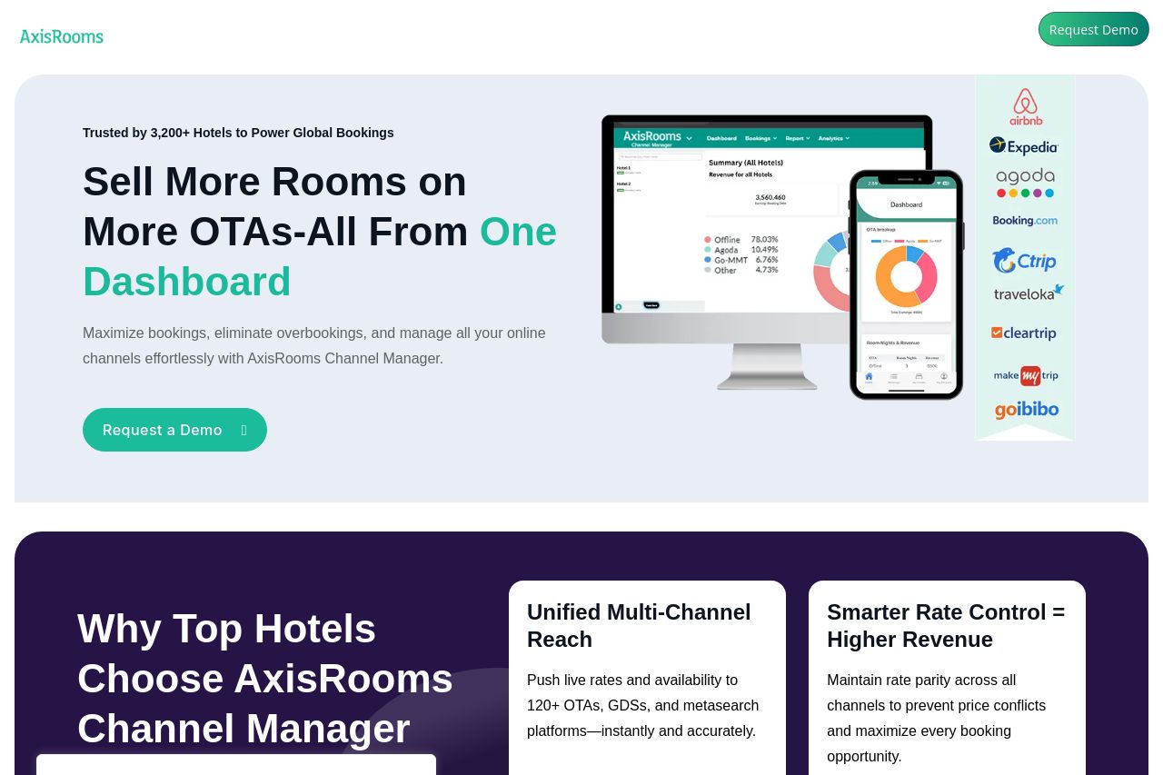
The hero headline promises selling more rooms across OTAs from a single dashboard, which is a decent hook, yet the core value proposition isn’t crystallized into a single, unmistakable benefit the moment a visitor lands on the page. The right-hand device mockups and a tall column of partner logos look impressive, but they compete with the headline for attention and distract from the primary action. Cookie banners and a chat widget sit stubbornly in the viewing area, breaking flow and creating a constant friction point before anyone can engage. Navigation feels implied rather than explicit, and several sections pile onto a heavy, dark purple backdrop without a clear hierarchy to guide the eye. The trust signals (logos, “Trusted by 3,200+ Hotels”) help, but the page doesn’t consistently translate that credibility into a concrete next step or demo… which is a missed conversion lever. Overall, it’s a powerful visual canvas that suffers from readability friction, inconsistent emphasis, and too many competing elements at the moment of truth. To win, prune the hero to a single, sharp benefit, remove the blocking overlays during initial scroll, tighten the CTA cadence, and reinforce a direct path to a demo or trial.
Key wins: strong logo spree and credibility cues, bold typography, and a clearly branded CTA. Key misses: unclear primary value in one glance, obstructive overlays, and a cluttered information flow that muddles next steps.
- Distill the hero: rewrite the main value proposition into one ultra-clear sentence (e.g., "Sell more rooms on 40+ OTAs with one dashboard—no manual syncing needed"). Place a single, prominent CTA directly beneath it, and move secondary CTAs to after the first scroll.
- Eliminate or delay overlays: defer the cookie/privacy banner and the live chat until after the user interacts (e.g., scrolls or clicks). Ensure those elements don’t obscure the hero copy or key buttons on load.
- Sharpen visual hierarchy: simplify the right-side visuals into a clean, supporting illustration or a simple product screenshot; reduce competing elements near the fold to keep the CTA dominant.