axisrooms.com
Landing Page Analysis
We value your privacy
63

Generated on:
February 1, 2026Score:
63/100Share on:
Summary:
60
Messaging
68
Readability
65
Structure
57
Actionability
64
Design
42
Credibility
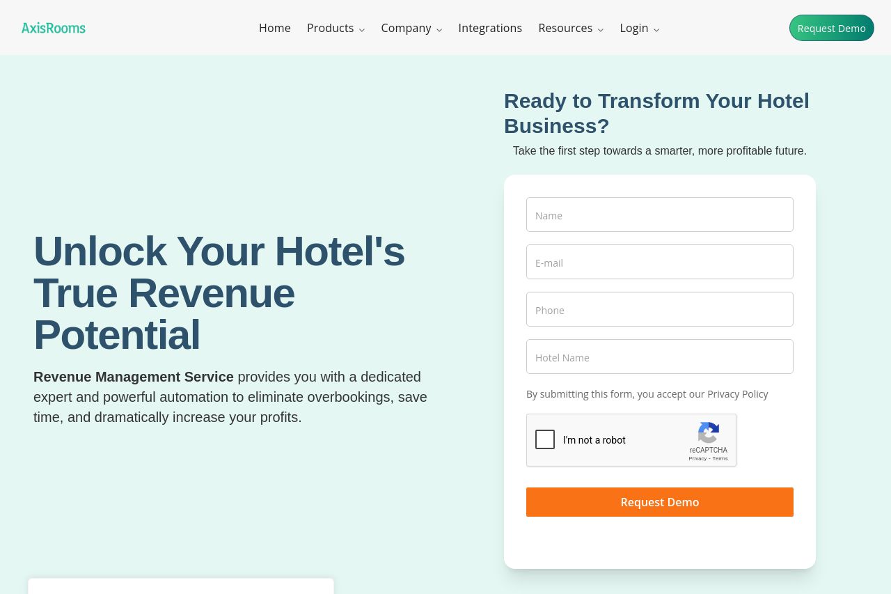
The page leans on a strong, punchy hero idea but it fights with its own layout. big, bold headline on the left, a boxed form on the right, and a cookie banner that can’t stop crowding the view. Color contrast is decent, but content density is high for a first impression and the CTA intent isn’t crystal clear beyond “Request Demo.” The comparison table and “The AxisRooms Advantage” create a lot of surface-area clutter, which makes the value proposition feel diffuse. Overall, it shows promise, but the UX friction and lack of crisp targeting undermine persuasion.
Main Recommendations:
- Clarify the core value in one unmistakable sentence above the fold and repeat it in a subhead. For example: "Automated revenue optimization for hotels that reduces overbooking and boosts ARR by X%".
- Move the primary CTA into a more prominent, consistently visible place (e.g., a sticky header CTA and a single, action-driven hero CTA) instead of relying on a long form tucked in the right column.
- Reduce on-page clutter by trimming or condensing the comparison table and the multi-panel sections. Use scannable bullets, icons, and a clear visual hierarchy to guide the reader to the demo/form sooner.