squarespace.com
Landing Page Analysis
Clear, confident fundraising support for nonprofits. From strategy to donor engagement, Brazen helps leaders raise money without overwhelm.
Summary:
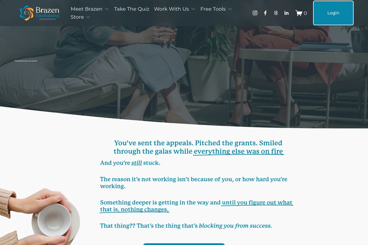
Bold look, bigger promises, and a lot of personality. Brazen Fundraising nails a premium, newsroom-meets-nonprofit vibe with a strong teal/blue palette and oversized typography that demands attention. The header navigation is dense but familiar, and the hero visuals feel confident. The real trouble starts as you scroll: the main value proposition isn’t crystal-clear in the hero, so first-time visitors have to infer what the product actually does and what outcome they’ll get. There are a lot of cool, bold statements, but they don’t translate into a concrete, repeatable promise like “we help nonprofits raise X with Y method.” The copy often reads like a series of assertions rather than a concrete benefit ladder, which makes the page feel inspired but unfocused. The layout tosses you between two-column hero blocks, testimonials area, and portfolio-esque “Hear From Our Clients,” but the hierarchy doesn’t always guide the eye to the most important next step. CTAs exist, but they feel uneven across sections and aren’t consistently placed where a reader is primed to act. Trust signals are present (client list, “Hear From Our Clients”), but they’re not integrated early enough to shore up credibility before a reader gets lost in the long-form sections. Open Graph data provides a solid starting point, but the on-page messaging and visuals don’t always align with the promise in the OG title/description. Overall, it’s visually distinctive and ambitious, but the core message and conversion flow need sharpening to stop visitors from wandering off and to convert them into inquiries or demos.
Open Graph data looks decent, but could be tightened to tightly reflect a single, benefit-driven promise and a sharper CTA. The attached image will work for branding, but ensure it scales correctly across social previews and includes accessible alt text for screen readers.
- Clarify the main value proposition in the hero with a single, benefit-driven line (example: “We help nonprofits raise more funds with less turmoil.”) and back it with a concrete demo, case study, or measurable outcome.
- Consolidate CTAs: pick one primary action (for example, “Let’s Talk”) and a minimal secondary option. Place the primary CTA after every major section, ensure it's visually distinct, and keep copy action-oriented (verb + outcome).
- Accelerate credibility early: add a concise client-success blurb or logo strip in the hero fold, plus two short testimonials above the fold to establish trust before readers scroll further.
- Tighten readability: break long paragraphs into shorter blocks, use subheadings after hero to guide readers, and ensure line lengths are comfortable for scanning on both desktop and mobile.
- Align Open Graph with on-page messaging: modify OG title/description to reflect a tangible benefit and a clear CTA so shares drive qualified traffic.
- Improve accessibility: add alt text for all images used in hero and social cards, ensure color contrast meets accessibility guidelines, and use responsive typography for readability on mobile.