admissionssolution.com
Landing Page Analysis
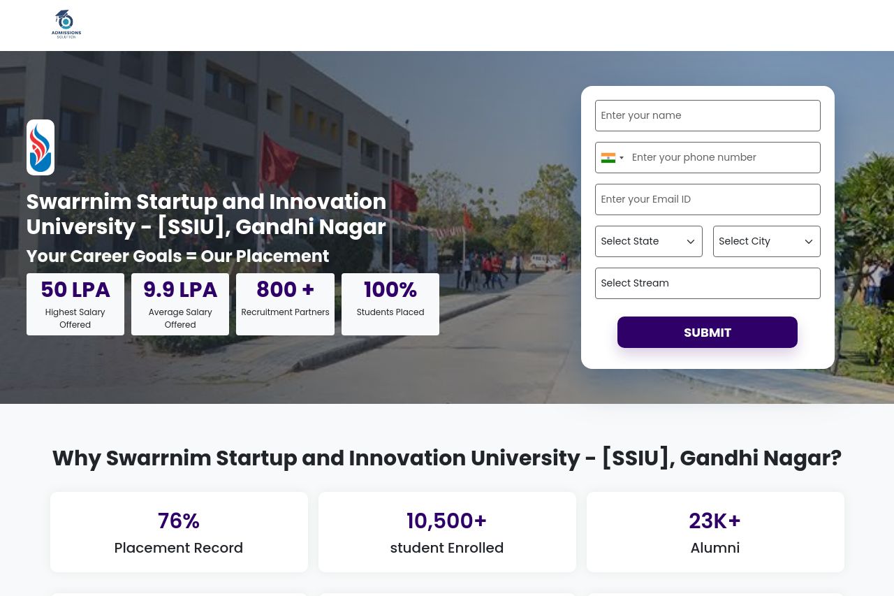
Apply for Swarrnim University (SSIU) 2026 Admissions. India's first Startup University with 100% placements. B.Tech, MBA, and Health Sciences.
Summary:
This hero section is a momentum-killer dressed as a conversion device. The big campus photo, a floating white form on the right, and a row of flashy stats try to shout “trust us” at you, but they fight for attention instead of guiding action. The main value proposition is muddled by the juxtaposition of “Swarrnim Startup and Innovation University” with a generic placement claim. The CTA feels kind of tacked on: a big Submit button in purple, while the form fields scream for context. Below the fold, the page doubles down on a grid of program cards, recruiter logos, and banners that read like a catalog rather than a persuasive pathway to enrollment. Overall, it looks polished, but not purposeful. It tells you there are options, not why you should pick this university over the thousands of others. The consistency in CTAs is off (Submit vs Apply Now), and there’s no single, crystal-clear outcome the user should pursue in this moment.
What works well enough to keep: the visual hierarchy does push the hero forward, the numbers in the stat cards give quick social proof, and the recruiter logos at the bottom add a veneer of credibility. What kills it: lack of a tight, single-value promise, inconsistent CTAs, and content that feels more like a showroom than a decision-making funnel.
- Clarify the core promise in the hero: replace or supplement the headline with a crisp, benefit-focused line like “Earn degrees with 100% placement support—start your career today.” Make the value proposition explicit within the first 2–3 sentences.
- Harmonize CTAs across the page. If the hero uses a Submit button, make it clearly action-oriented (e.g., "Get Program Info" or "Apply Now"). Use the same label consistently for all primary actions across sections to reduce cognitive load.
- Reduce cognitive load in the hero. Either simplify the right-hand form (fewer fields or a collapsible/overlay modal) or move it to a single-column layout that doesn’t overpower the hero image. Add a short explainer video or a 1-line bulleted list of top programs to anchor context.
- Improve readability against the hero image by dialing contrast: consider a slightly darker overlay behind the headline or a lighter card for the form to ensure text is legible at a glance.
- Add explicit, scannable next steps after the hero (e.g., a short “What you’ll get by enrolling” section) so users know exactly what action they’re taking and what outcomes to expect.
- If you keep the numeric stats, source them or replace with time-bound, verifiable metrics to build trust (e.g., “75% placement in 2024 graduates”).
- Introduce a consistent information architecture cue: a single, visible breadcrumb or section tag at the top that communicates where users are and what they’ll find next.