omnitracker.com
Landing Page Analysis
Ein Teil der Daten, die dieser Anbieter gesammelt hat, dient der Personalisierung und der Messung der Werbewirksamkeit.

Summary:
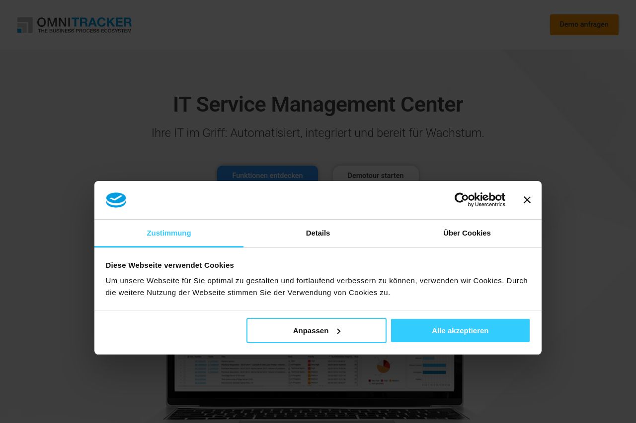
Open Graph tease: the page title promises “IT Servicemanagement Center – OMNITRACKER – Efficient ITSM for Modern Enterprises,” but the on-page messaging barely scratches that clarity. The hero screams generic “IT Service Management Center” while the subhead is vague, and the OG line about efficiency isn’t echoed in concrete benefits. A blocking cookie modal further ruins first impressions, obscuring value and CTA visibility. The header has a high-contrast orange “Demo anfragen” CTA, which is good, but everything else reads as a bland, boilerplate B2B page: no razor-sharp positioning, barely defined audience, and scant evidence beyond a single stat line. The cookie banner is functional but brutal in UX, stealing attention right as you try to scan benefits. Overall, you’re trading clarity for compliance and call-to-action clutter. The page feels mid-funnel polite, not hard-hitting enough to convert visitors who land with intent. Bold, specific messaging and friction-reducing paths are missing. Despite a solid trust vibe in some areas (footer logos, customer stat), the combination of ambiguous hero copy, weak demos or previews, and an intrusive cookie modal makes the page feel slow and forgettable.
Key thrusts:
- The value proposition is murky. Readers should know exactly what OMNITRACKER ITSM delivers in 3 seconds.
- Evidence of outcomes is thin beyond generic stats; require concrete use cases, customer logos, or short case videos.
- The cookie modal is too aggressive; it kills reading flow and creates a negative first impression.
- The CTA structure is inconsistent across fold lines; there should be a single primary action above the fold with a secondary option clearly secondary.
- The OG data suggests a stronger positioning than the visible copy. Align on- page messaging with that promise.
- Rewrite the hero to mirror the OG promise: "Effiziente ITSM für moderne Unternehmen – Automatisiert, skalierbar, sichtbar." Add a 2–3 bullet benefits line beneath the headline (time saved, improved SLA, reduced toil). Replace or fundamentally simplify the cookie banner: show at most a bottom bar with minimal blocking and a primary CTA plus a secondary option; ensure the first paragraph of the cookie modal isn’t the main content. Add 2–3 customer logos or mini-case snippets under the hero to demonstrate real-world outcomes and industry relevance. Make the primary CTA language crisp and outcome-focused (e.g., "Kostenlos Demo anfordern" or "Jetzt Demo starten"). Tighten navigation so users can reach product details and demos within 2 clicks.