vercel.app
Landing Page Analysis
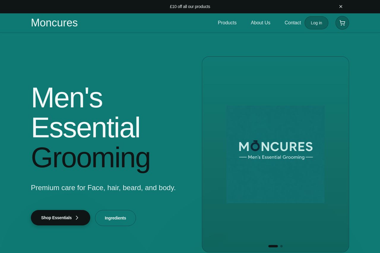
Premium care for Face, hair, beard, and body. A complete grooming system designed to simplify daily care.
Summary:
Bold, confident visuals, but it’s screaming “consumer brand” and not a convincing B2B partner. The Open Graph data is passable but the image is inaccessible, which will tank click-through when you share. Messaging leans heavily to “Men’s grooming” with product-focused hooks, but there’s zero explicit wholesale or enterprise value. For a B2B audience you need to flip the stance: emphasize partnerships, bulk orders, margins, and onboarding. Right now the page looks polished, but the target buyer will bounce because there’s no business rationale, no credibility signals, and no obvious way to talk to a buyer. Also, the OG data should better reflect a business offer, not just a consumer product tease. You’ve got style, you’re just missing a sales lever for partners.
Open Graph data is on the right track but the missing image, and bland description, will hurt performance when shared. Fix og:image accessibility, sharpen the hook for wholesale, and add a clear path to a partnership or bulk-order inquiry.
- Make og:image publicly accessible (host a proper image URL, 1200x630) and ensure it loads without errors for social previews.
- Rewrite og:title to speak to B2B/wholesale partnerships (e.g., Moncures Wholesale Grooming Solutions).
- Update og:description to highlight business benefits (bulk pricing, white-label opportunities, onboarding support) and include a clear call-to-action for partnerships.