parkercenter.net
Landing Page Analysis
Experience refined, natural-looking results with personalized plastic surgery in Paramus, New Jersey. Dr. Paul M. Parker delivers expert care and balanced outcomes.
Summary:
This page looks the part, but it’s every marketing cliché bundled into one maroon-and-white template. The hero copy is vague, the lead form is heavy-handed, and the trust elements feel tacked on rather than integrated. Visually it’s solid but not distinctive, and the navigation and content flow don’t actively guide the user to the next step. There are real opportunities to simplify, clarify, and accelerate conversion, but you’ll need to prune clutter, sharpen the promise, and tighten the ask.
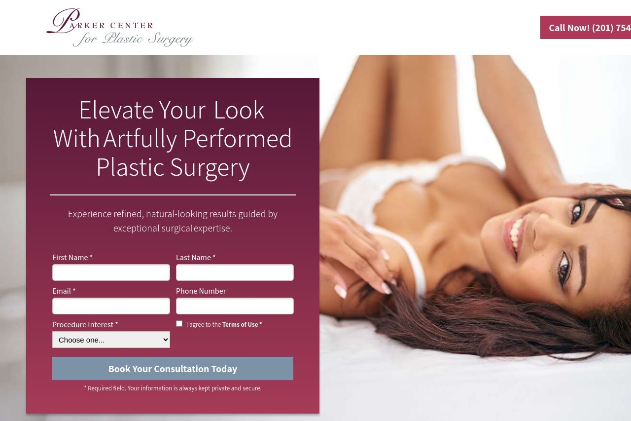
The hero dominates above the fold with a big maroon panel containing a form, but the main value proposition isn’t crystal clear or explicitly tied to a tangible outcome. The site relies on stock-like stock photography and generic claims rather than concrete patient outcomes. The rest of the page dithers between testimonials, procedures, financing, and FAQs without a strong, singular persuasion thread. The CTAs exist, but they’re not consistently prioritized or visually isolated across sections. The result is a pleasant but forgettable experience that won’t reliably convert first-time visitors into consultation bookings.**
- Clarify the primary value proposition in the hero: state a concrete outcome (e.g., "Natural-looking facial rejuvenation with board-certified surgeon Paul M. Parker"), and mention the target audience (e.g., Bergen County residents considering facelift, rhinoplasty, etc.).
- Move the form or make the signup CTA visually dominant across sections (sticky header CTA, after each major section) to reduce user effort and friction.
- Improve accessibility and contrast: ensure the maroon form panel has high-contrast text, provide alt text for all images, and add a privacy/consent notice right next to the form field labels.
- Streamline the information architecture: merge similar sections (before/after, why choose us, financing) into a clear, scroll-friendly journey with a single, recurring CTA anchor.
- Add specific social proof and credentials up front: identify the surgeon, show certifications/logos near the hero, and include a short, scannable credential badge (e.g., board-certified, years of experience).
- Improve mobile layout: ensure the hero form doesn’t overlap the image, and that the testimonials and features stack cleanly with readable font sizes.