parkercenter.net
Landing Page Analysis
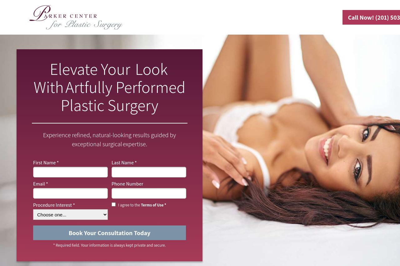
Experience refined, natural-looking results with personalized plastic surgery in Paramus, New Jersey. Dr. Paul M. Parker delivers expert care and balanced outcomes.
Summary:
This page has ambition, but it sacrifices clarity and trust in the process. The hero instantly signals a premium vibe with that maroon panel and a bold CTA, but the core promise isn’t crystal clear enough to convince a first-time visitor you’re the right choice. The big form on the left is visually dominant, which can deter conversions if people aren’t prepared to share info upfront. The right side shows a lifestyle image that competes for attention instead of reinforcing the benefit. Below the fold, there’s a strong portfolio of testimonials and several trust-building elements, yet there’s a lack of tangible proof (board-certification, pricing structures, explicit guarantees) that would push someone from interest to booking. The navigation and section order feel sensible, but the risk is overwhelm: too many sections, too many bullets, and long paragraphs in places where skimmability matters. Overall, you’ve got design polish and credible elements, but the messaging and ROI-focused clarity are undercooked. Tighten the value props, streamline CTAs, and foreground outcomes and guarantees to push conversions across devices.
- Make the main value proposition literal and location-specific (e.g., “Board-certified plastic surgeons in Paramus, NJ delivering natural-looking results”). Show a quick preview or before/after snapshot near the hero to reinforce benefits.
- Reduce hero clutter by moving or tucking the form into a more scannable module (or a modal) after a stronger, benefit-driven headline. Ensure the CTA is the most prominent element on the fold.
- Add hard credibility signals early: board-cert logos, medical affiliations, and a short, explicit guarantee (e.g., “Natural results within X months”) near the hero.
- Improve CTA clarity and consistency: one primary CTA per section, with action-oriented text (e.g., “Book Your Consultation Today”) and a secondary CTA only where it adds real value.
- Honor trust with transparency: include pricing ranges or financing details upfront and a clear privacy promise next to the form.
- Improve skimmability: break long paragraphs into bite-sized bullets or two-sentence blocks, especially under headings like “Why Patients Choose Parker Center.”