parkercenter.net
Landing Page Analysis
Experience refined, natural-looking results with personalized plastic surgery in Paramus, New Jersey. Dr. Paul M. Parker delivers expert care and balanced outcomes.
Summary:
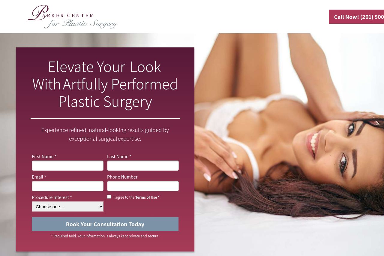
The page has strong visual branding but a messy conversion path. The hero overlay maroon panel with a long form defeats readability. The value proposition is not crystal clear and lacks explicit audience. CTAs exist but are not consistently placed. The testimonials section is decent but not enough to build trust. The rest of the sections (Why choose us, FAQs, financing, transformation) are long blocks of text that slow the user down. The nudity warning overlay is jarring and could violate safety or privacy guidelines. The overall impression is high-gloss, but the layout doesn't guide users toward booking.
There are multiple opportunities to tighten the copy, streamline the form, and create a single, obvious path to conversion. The site could benefit from removing crowding in the hero, clarifying the service value, and establishing stronger credibility signals early on (address, physician credentials, transparent pricing).**
- Clarify the value proposition in the hero: specify the exact procedures or outcomes and clearly state who this is for (e.g., adults considering cosmetic refinement, not teenagers). Replace vague phrasing with concrete benefits and a quick demo or example outcome.
- Consolidate and simplify the hero form: reduce to 3-4 fields max, remove the Terms of Use checkbox from immediate view, and move the consent to a privacy-friendly link. Ensure the CTA is a single, dominant action with a clear verb (e.g., "Book Your Consultation Now").
- Streamline the navigation and content hierarchy: place testimonials and credentials above the fold, reduce long paragraphs, use scannable bullets, and center sections around a single conversion goal per screen.