beautyplasticsurgery.com
Landing Page Analysis
Keep in mind that each patient is unique and your results may vary.
Summary:
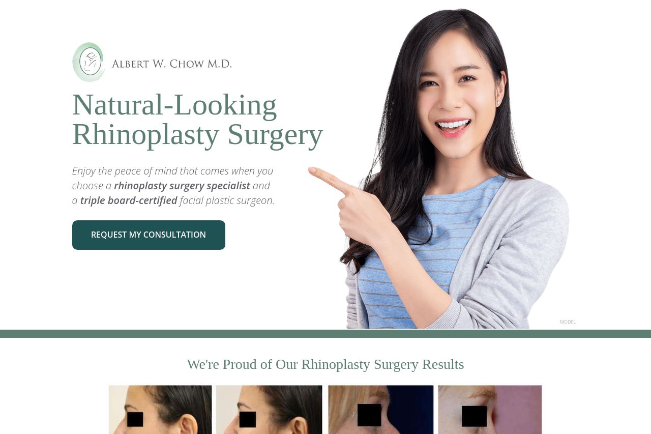
The hero looks clean and premium, but the value prop barely nods to the target: a San Francisco, Asian-nose-focused audience. It’s visually strong, yet the copy is generic and too long in the hero, which kills quick-scan clarity for a busy 28-year-old. The page stacks content with big blocks of text, then dumps testimonials later, which feels like afterthought credibility. The navigation is not obvious once you scroll, and there’s a lot of content without tight scannable structure. The design uses a calm color palette that fits a medical-cv aesthetic, but the hierarchy and contrast could be sharper to guide the eye toward the most important actions. The Open Graph metadata is missing, which hurts social shares and preview clicks. In short: it looks trustworthy, but it doesn’t reason as efficiently for an Asian, SF-based reader to book a consult today. Overall, the page communicates competence, but it’s too slow to convert and too generic for a highly specific audience.
- Rewrite the hero headline to explicitly speak to Asian-nose concerns and SF-based expertise (e.g., 'San Francisco-based Asian rhinoplasty expert delivering natural results' ).
- Shorten the hero copy and add a quick bulleted benefit list beneath the main headline to improve skim-read clarity.
- Create a single, primary call-to-action that sits above the fold and clearly asks for a consult, plus a subtle secondary CTA for more info.
- Add targeted social proof near the fold (Asian patients, SF testimonials) rather than burying them further down.
- Improve Open Graph data and meta previews (title, description, image) to boost social sharing and click-throughs.