gaardbyesupply.com
Landing Page Analysis
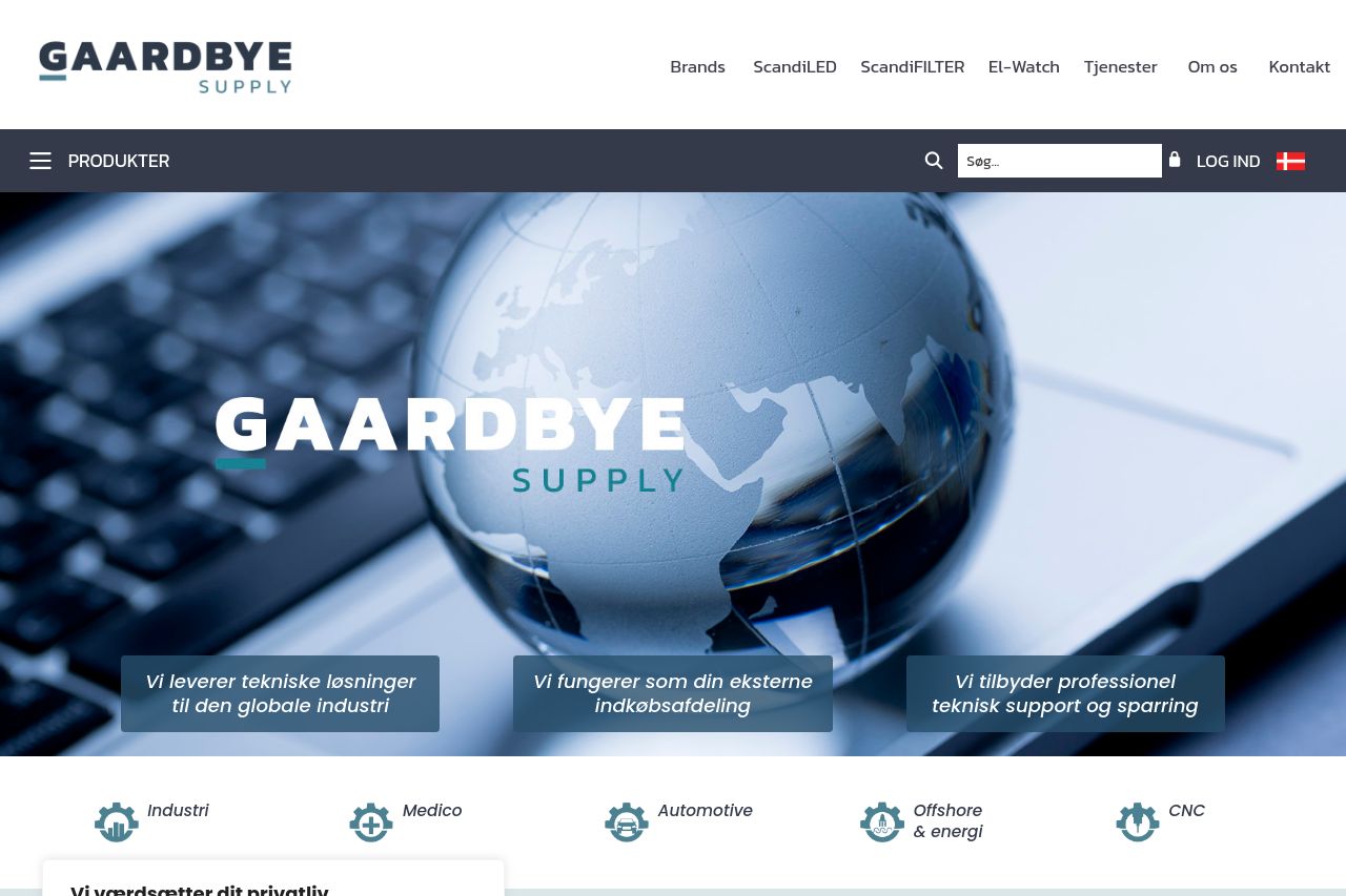
Vi værdsætter dit privatliv
Summary:
Bold branding in a clean, industrial vibe, but the page reads like a brochure clueless about concrete actions. The hero image dominates, yet the value proposition is muddy and there’s zero urgency or primary CTA above the fold. Three Danish value statements sit on overlay blocks—great concept, terrible execution: readability suffers because text competes with a busy image, and there’s no single message to guide a buyer. The product grid exists, but it’s a carousel with prices shown faintly, not scannable or searchable. Trust signals are weak (no case studies or client logos front-and-center), and the cookie banner sodomizes the browsing experience, blocking content on every scroll. Overall it feels polished but passive for a B2B audience that needs fast clarity, proof, and a clear next step. You’re missing explicit use cases, measurable benefits, and a strong, context-specific CTA that moves procurement professionals toward a quote or demo.
Bottom line: the page looks credible from afar, but the conversion engine is broken at the hinge—hero clarity, CTAs, credibility, and UX flow all need a jailbreak to stop losing serious buyers at the first fold.
- Create a single, crystal-clear value proposition above the fold and pair it with a prominent, action-oriented CTA (for example: “Get a Quote” or “View Industry Solutions”).
- Tighten the hero copy: replace the three overlay statements with concise benefit bullets and a bold sub-headline that speaks directly to procurement teams in manufacturing/industrial sectors.
- Deprioritize the cookie banner UX: move it to a less intrusive position, ensure it doesn’t block the hero/content on mobile, and add a primary navigation cue to trust signals (testimonials, client logos) nearby.
- Add explicit social proof and industry-specific use cases (short client spotlight or 2-3 metrics) and surface them near the top to boost credibility for B2B buyers.