co.id
Landing Page Analysis
Summary:
The hero sets a decent mood and brand color, but the page never actually tells a business why anyone should care.
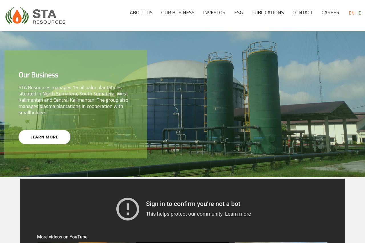
The top navigation looks functional, but the hero area is doing work it isn’t paid for. a green translucent panel on a big palm-oil landscape is visually bold, yet the text inside – “Who we are” and a short paragraph – reads like corporate boilerplate instead of a concrete value proposition. The main CTA button says only “LEARN MORE,” which is vague in a B2B context and does not imply ROI, a specific outcome, or a real next step (case study, proposal, or product demo).
Below the fold, the Latest News section provides a feed of articles, but there’s no thread tying these to customer outcomes, buyer personas, or industry concerns. The design shifts from a clean hero to a crowded content area with large image blocks and dense captions, which compounds the confusion about what STA Resources actually offers to businesses.
The color blocking (green/orange) is vibrant, which helps branding, but the sections feel visually disconnected rather than part of a coherent B2B narrative. There are no testimonials, client logos, awards, or concrete case studies to boost credibility, and the footer is heavy with generic links rather than a trusted, contact-friendly closing.
Overall, the site signals “we are a company,” but it does not convincingly answer: what problem do we solve for business buyers, why should they care, and what’s the exact action we want them to take right now? The result is a pleasant aesthetic with a clueless value story.
- Rewrite the hero value proposition to a single, crisp line that states the concrete business outcome, e.g., "Secure, sustainable palm oil supply with ESG leadership for global buyers"; follow with 2 short bullets of benefits and an explicit demo/proposal CTA.
- Change the CTA from a generic 'LEARN MORE' to outcome-driven actions like 'Get a Proposal', 'View Case Study', or 'Watch Demo' and place CTAs after each major section to guide the buyer journey.
- Add a credible proof block in the hero or near it: a short client logo strip, a prominent testimonial, or a link to a case study that quantifies ROI (cost savings, yield, sustainability metrics).
- Harmonize the hero copy with the rest of the page: ensure typography, contrast, and spacing improve readability, and keep a consistent business-focused tone.