nfckey.com
Landing Page Analysis
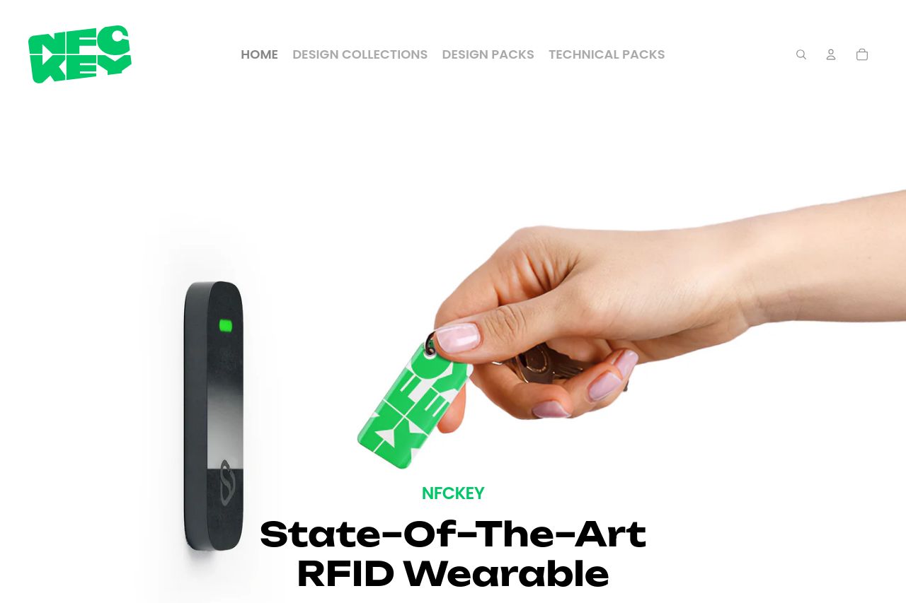
State–Of–The–Art RFID Wearable
0
Share on:
Summary:
0
Messaging
0
Readability
0
Structure
0
Actionability
0
Design
0
Credibility
Open Graph data is bland and underperforming. The title is just the domain, which tells you nothing about the product or the benefit, so it won’t stand out in feeds. The description is a generic tag line that doesn’t explain why someone should click or what problem the RFID wearable solves. The attached image is visually strong but it’s a straight product shot cropped in social previews, which can look awkward and fail to tell a story. There’s no branding, no value proposition, and no social proof cue (logos, awards, or quick benefits) that would improve click-through. Overall, the OG data fails to communicate a clear reason to engage and doesn’t leverage any platform-specific strengths.
Main Recommendations:
- Rewrite og:title to something benefits-focused and specific to NFCKEY, e.g. 'NFCKEY RFID Wearables — A Smarter Card Replacement for Access and Identity'.
- Craft an og:description that highlights the core benefit in 120–160 characters, e.g. 'Wearable RFID that replaces plastic cards for easy access, transport, and events — fully customizable for your brand.'
- Replace or supplement the image with a more compelling lifestyle/usage shot sized 1200x630 (1.91:1) that clearly shows the wearable in action and includes branding elements.
- Add branding to the OG image (logo watermark) and provide alt text for accessibility (e.g., 'NFCKEY RFID wearable being used for door access').
- Optionally include a second og:image (lifestyle or product in context) to improve CTR on platforms that rotate images.