circle.so
Landing Page Analysis
Training is hard. Figuring out nutrition shouldn’t be.
0
Generated on:
January 2, 2026Score:
0/100Audience:
RunnersShare on:
Summary:
0
Messaging
0
Readability
0
Structure
0
Actionability
0
Design
0
Credibility
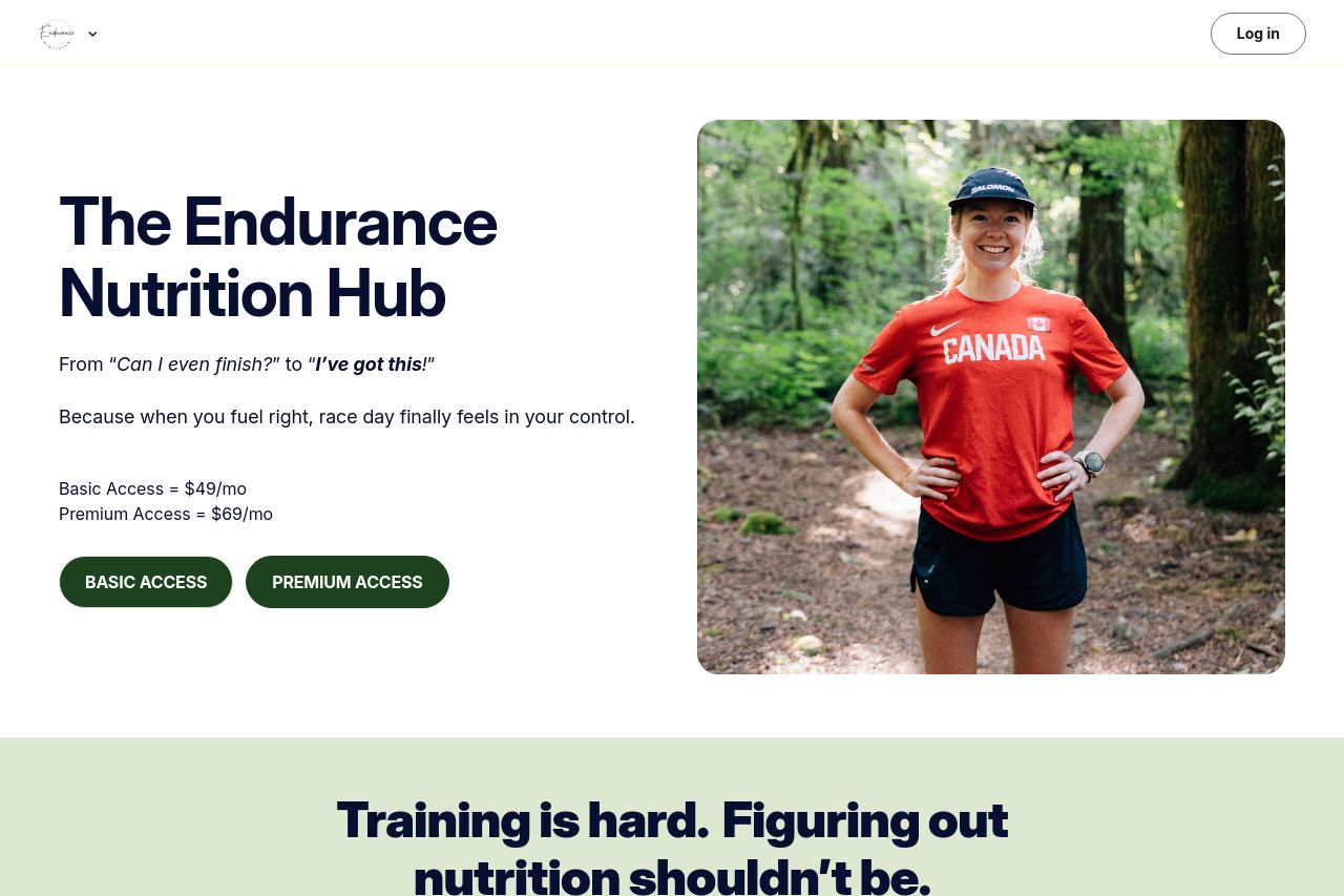
Open Graph data is basically non-existent. The share preview will look like a ghost if you post this page, because there are no og:title or og:description tags to describe what the user is clicking. The attached runner image is perfect for a social teaser, but without explicit og:image metadata, social crawlers will grab something random or fail to render nicely. That’s a wasted opportunity to hook runners before they even land on the page. At minimum you need og:title, og:description, og:url, og:type, and og:image. Also consider a twitter card so the card looks great on Twitter. Right now, your social preview is nothing to brag about; fix this or you’re leaving clicks on the table.
Main Recommendations:
- Add og:title and og:description to the page head. Recommend: og:title = "The Endurance Nutrition Hub — Fuel Your Run"; og:description = "Train smarter with nutrition coaching, race-day fueling plans, and community support designed for runners. Choose Basic or Premium."
- Set og:image to the attached runner photo (provide a direct https URL) and declare og:image:width and og:image:height (e.g., 1200x630). Consider also including a square 1:1 version for better social fit and multiple sizes if possible.
- Add Twitter cards: include twitter:card = "summary_large_image", twitter:title, twitter:description, and twitter:image mirrors of the OG data, so the share looks premium across platforms.