uistudioai.dev
Landing Page Analysis
Point, prompt, ship
Summary:
Bold hero, clean aesthetic, but the message is fuzzy for your target founders and indie devs.
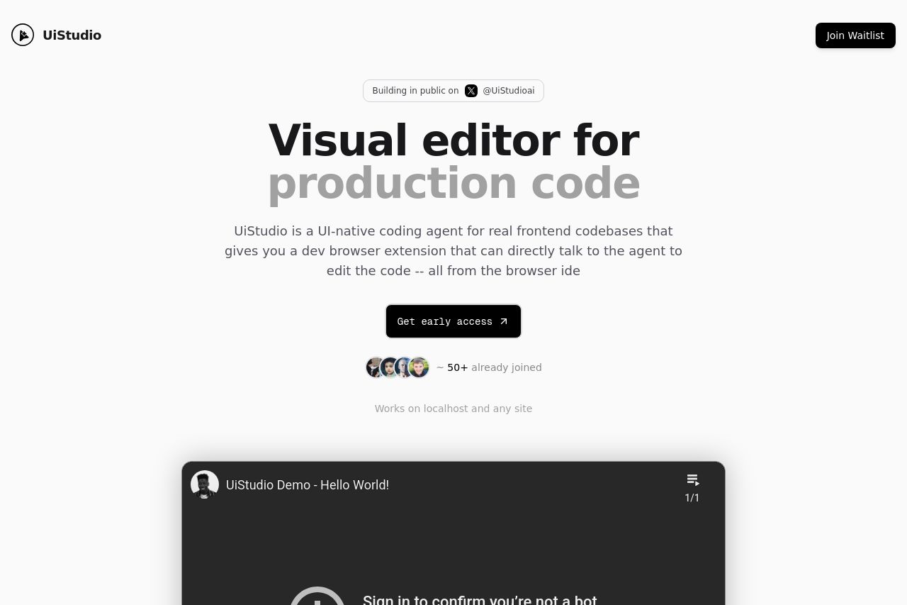
The headline is visually striking, but it doesn’t crisply answer: what do you enable a dev team to actually do better, faster, or cheaper? The subhead is long and uses a pale gray that hurts readability, so scannability suffers right when attention should be lock-in. There’s a vague promise of “a dev browser extension that can directly talk to the agent to edit the code” but no concrete outcome or use case that a founder would care about (ship faster, reduce context switching, cut onboarding). Social proof is there (avatars and “50+ joined”) but it’s ambiguous and lacks logos, names, or any tangible credibility. The embedded demo/video at the fold is visually heavy and distracting rather than explaining the core value. Open Graph data is misaligned with the page content (see OG below), which will tank click-through when shared. There are no pricing details, feature lists, or explicit audience targeting on the page, and no clear trust signals (physical address, contact, policies). Bottom line: visitors don’t feel the product, the audience, or the next step with enough clarity to act.
The result is a good-looking landing that looks like a teaser, but it fails as a conversion page for founders, indie devs, agencies, and solo devs who need concrete value, risk mitigation, and a clear path to trial or sign-up.
- Clarify the core value proposition in 1 sentence above the fold (e.g., "Edit frontend production code visually in your browser to ship faster without leaving your IDE") and repeat it in a short bullet list of 2-3 benefits.
- Explicitly name the target audience on the hero (e.g., "for founders, indie devs, and agencies who build frontend apps").
- Replace the gray subheading with a scannable 2-3 line blurb that outlines concrete outcomes (time saved, fewer context switches, easier collaboration), then show a quick visual demo or 1-2 concrete use cases.
- Add concrete trust signals (logos, 2-3 customer quotes, founder identity, or a link to a case study) and a simple demo/video caption that explains what the viewer will see.
- Fix Open Graph alignment (see OG section) to prevent misalignment when shared.