uistudioai.dev
Landing Page Analysis
Point, prompt, ship

Summary:
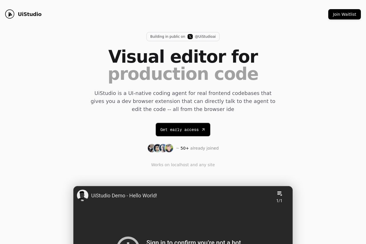
Bold, minimalist hero grabs attention, but the messaging is a mess.
The headline – “Visual editor for production code” – looks impressive, but the promise isn’t concrete for a B2B buyer. The gray subheadline floats in the hero competing for attention and it’s long and vague: it doesn’t clearly state what UiStudio does for teams, what problem it solves, or what the exact outcome is. The supporting copy beneath is generic and fails to anchor to a specific target audience or measurable benefit. The hero demo/video is visually appealing, but it distracts from understanding the actual value prop and the primary action. CTAs exist (Get early access) but there’s no sense of urgency, no pricing/plan clarity, and no proof signals to reduce risk. The page looks polished, but the core credibility signals (case studies, logos, success metrics, explicit buyer personas) are missing. In short: beautiful wallpaper, terrible substance. To move from first impression to conversion, the copy must be crisp, buyer-specific, and supported by proof near the hero.
- Rewrite the hero to deliver a crystal-clear value proposition aimed at a specific buyer (e.g., Frontend teams/Design systems) with a tangible outcome: e.g., “Edit production frontend code in-browser with an AI agent and ship updates 3x faster.”
- Add 1–2 concrete use cases or previews right under the headline to show real-world impact (e.g., “Patch UI bugs in live apps without leaving the browser”).
- Introduce credibility signals near the hero: customer logos, a one-liner metric (e.g., “Used by 50+ teams”), or a short testimonial; replace or accompany the demo visual with a clear CTA path (pricing/trial) and a time-bound offer.