repairthebond.com
Landing Page Analysis
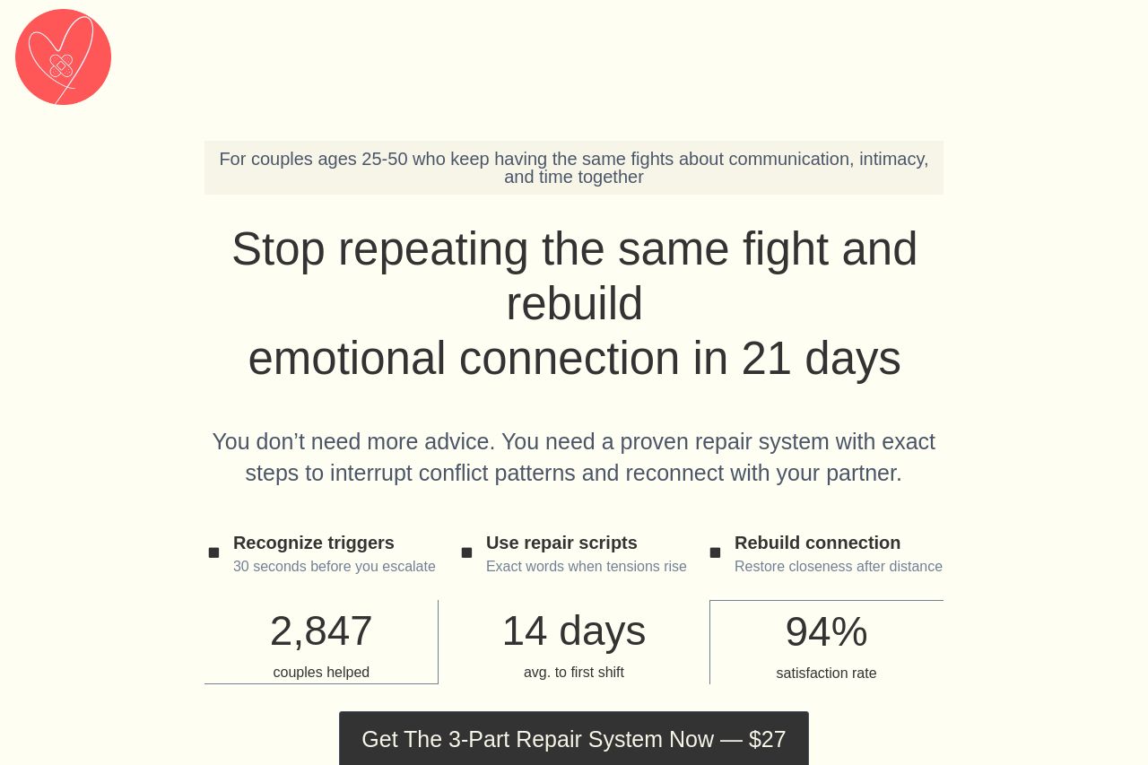
You don’t need more advice. You need a proven repair system with exact steps to interrupt conflict patterns and reconnect with your partner.

Summary:
The page has a warm, friendly vibe and it leans into real-world testimonials, which helps trust. The hero makes an emotional promise and there are clear benefits listed later (recognize triggers, repair scripts, rebuild connection). But the core value prop isn’t crystal clear from a quick scan, and the messaging feels meandering between emotional storytelling and hard-sell pricing. The structure is sprawling: hero, stats, three-column learning blocks, success stories, and a FAQ, all of which dilutes focus. The main CTA exists and is strong, but it isn’t immediately obvious what you actually get beyond the label “3-Part Repair System.” The long-form copy, dense sections and mobile-unfriendly grids.tax readability. The price is buried in mid- and lower-page blocks and the “limited time offer” nudge is present, but trust signals could be stronger (no author bio, little policy visibility, inconsistent visuals). The design is coherent and approachable, but typography and contrast could be tightened for faster scanning, especially on mobile. In short: emotionally resonant, but the value proposition is hazy, the layout and copy require tightening for quick comprehension and risk reduction. If you want a one-liner to land on awareness, reframe the hero to say exactly what the reader gets in practical terms within 21 days, then anchor that with a single, bold CTA near the top and a preview sample right away.
- Cut the hero to a single crystal-clear benefit statement that answers: What exactly will the reader achieve in 21 days? (e.g., "Rebuild emotional connection in 21 days with a proven 3-step system"), and place price and what they get next to that hook.
- Move price, inclusions, and a quick preview above the fold so visitors don’t have to scroll to know the offer and risk.
- Tighten credibility: add a concise founder/author bio, a privacy/return policy, and at least one other trust signal (photo of a real team, logo of any partners) to reduce skepticism.