ghlengine.com
Landing Page Analysis
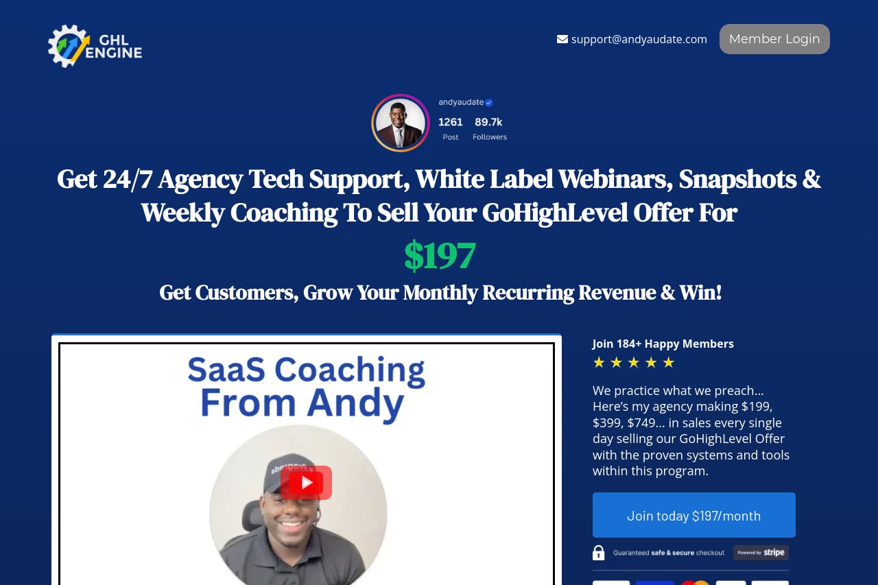
Get GHL SaaS Customers, Grow Your Monthly Recurring Revenue & Win!
0
Share on:
Summary:
0
Messaging
0
Readability
0
Structure
0
Actionability
0
Design
0
Credibility
The page is loud and disjointed, and the Open Graph data mirrors that lack of polish. The OG preview should be clean and on-brand, not a gut-punch of long copy and a messy image. The current title/description read like sales spam and don’t clearly communicate value or target audience. The attached image (a modal overlay) is not social-friendly and will crop badly in feeds. You need a concise, benefit-driven OG setup with a branded image that scales well across platforms.
Main Recommendations:
- Shorten and sharpen the OG title to a ~60-character value prop that reflects the page focus. Example: '24/7 SaaS Coaching & White-Label Content for Agencies'
- Rewrite the OG description to clearly state the benefit and who it’s for. Example: 'Grow your SaaS revenue with expert coaching, ready-to-use templates, and exclusive content.'
- Replace the attached modal screenshot with a clean, branded OG image (1200x630, minimal text, logo visible) and ensure it renders well when cropped on social feeds.
- Add canonical OG tags (og:url, og:type as website, og:site_name) and ensure the image is hosted publicly with proper accessibility attributes (alt text).