hirz.app
Landing Page Analysis
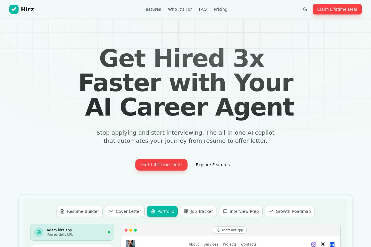
Land your ideal role faster with AI-powered resume builder, cover letter generator, job tracker, interview prep, and personalized growth roadmap.
Summary:
Hirz shoots for bold, friendly vibes, and the big hero imagery nails attention. The main promise—Get Hired 3x Faster with Your AI Career Agent—lands quickly and feels plausible for a job-seeker audience. The subhead does a decent job of expanding on AI copiloting from resume to offer letter, which is a strong framing hook. Where it starts slipping is clarity and credibility in a few places: the hero copy relies on a few abstract buzzwords (AI Career Agent, copilot) without showing immediate, concrete outcomes or a quick preview for job seekers. The repeated CTA language (Get Lifetime Deal / Claim My Spot) flattens the journey a bit and can feel salesy rather than value-driven. The color and typography are visually engaging, but long, dense hero lines risk overwhelming users skimming on mobile. The “Everything you need to land your dream job” section is solid for alignment, but the subsequent grid of feature blocks is a bit heterogeneous in emphasis—some blocks feel like marketing blurbs, others like concrete tools. The pricing block communicates a strong, time-sensitive offer, which can push urgency—but the main navigation and CTA surfaces are not always clearly differentiated for a first-time visitor who is a job seeker looking for a straightforward path to apply, not just a product suite. In Open Graph terms, the provided title and description align with the hero content, but the OG image should be optimized to translate the on-site hierarchy into a compact shareable card with a clear benefit and a strong CTA. The page could benefit from more explicit audience positioning (e.g., “New grads,” “Mid-level Pros,” “Executives”) in the hero framing and a visible preview/demo or quick 1-2 sentence use case that ties the features to real hiring outcomes. Overall, it’s visually compelling and idea-rich, but the messaging needs sharper audience tuning and a more scannable, outcome-focused copy ladder.
Highlights for OG feedback: your OG title mirrors your product framing, which is good, but your description would benefit from a single, crisp benefit statement and a CTA that invites click-through (e.g., “See how Hirz shortens your job search with AI-powered resume and letter tools”). If the image is the hero collage, consider adding a succinct caption or a visual cue that reinforces the primary benefit (faster hires) and a clear early CTA.
- Clarify value proposition in one line above the fold with a concrete job-seeking outcome (e.g., “Land offers faster with AI-optimized resumes and tailored outreach”).
- Replace or de-emphasize multiple lifetime-era CTAs in the hero and top nav; use a single, action-oriented primary CTA (e.g., “Get Your Career Toolkit Now”) and a secondary supportive CTA (e.g., “See a Demo”).
- Revise OG data to include a compact benefit statement and a strong CTA; ensure the image includes Hirz branding and a visible button-like element (CTA) so it’s eye-catching when shared.