emergentagent.com
Landing Page Analysis
A product of emergent.sh

Summary:
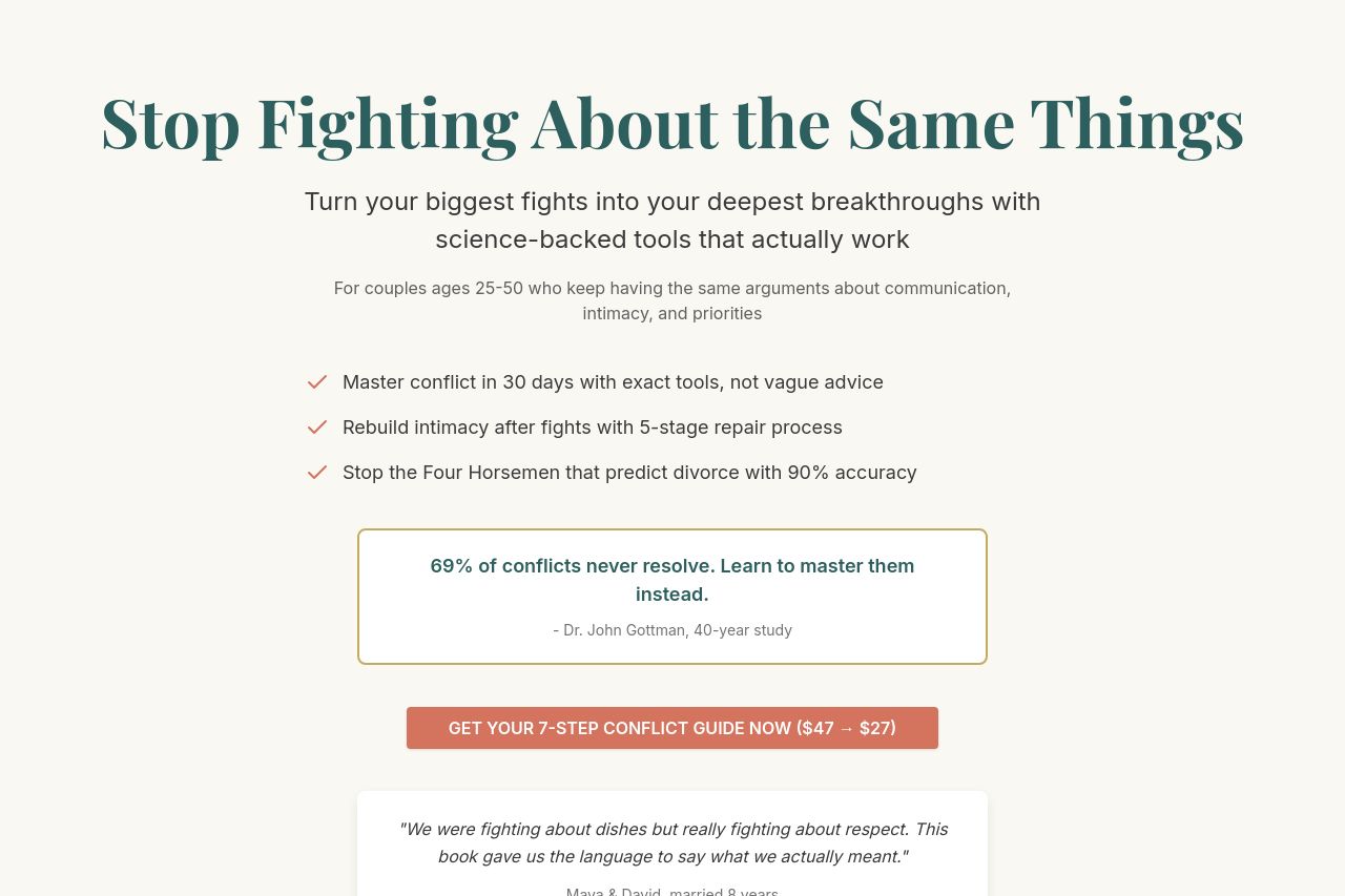
Bold, warm, and pictured as a rescue for stressed couples, this page starts with a big promise: “Stop Fighting About the Same Things.” It hungrily tells you what you’ll get (master conflict, rebuild intimacy, stop the Four Horsemen) and then flaunts a wall of interior content (chapters, sample PDFs, previews) like a threat of missing out. The tone nails the empathy angle, but the value proposition remains vaguely framed as a “7-step conflict guide” without a crisp, testable outcome or a concrete, visible demo up front. The audience is clearly couples in a rut, but the hero copy doesn’t consistently anchor to what they’ll actually experience in week 1. The pricing and discount messaging show up early, which can trigger price resistance rather than trust. Overall, the page looks gorgeous and reassuring, but it overreaches with claims, relies on long-form content to build credibility, and offers too many steps without a crisp, punchy first-step promise. In short: pretty, persuasive, and, frankly, a little unfocused about what you’ll actually buy and whether it works for your specific relationship, right now.
Pros: strong, empathetic framing; clear benefits; visually calm design; solid structure for sections like FAQs and testimonials.
Cons: hero value proposition isn’t crystal clear at first glance; heavy content depth without early social proof; discount/price claims feel surface-level without risk reversal; CTAs feel a bit buried in sections and could be more action-oriented earlier.
Overall impression: a high-aspiration landing that needs tighter proof, more concrete first-step outcomes, and sharper trust signals to convert skeptical couples on day 1.
- Tighten the hero promise into a single, crystal-clear outcome (e.g., "A 30-day plan to stop the same fights and regain trust—no guesswork"). Include a quick, concrete demo or sample of the first chapter or a short video snippet.
- Integrate trust signals near the hero: a short testimonial reel, a logo strip, or a trust badge to counter the rapid price claim.
- Reduce the cognitive load by reorganizing sections: move a short 1-2 sentence product explanation and a single CTA above the fold, then push the full table of contents behind a clearly labeled preview link.