emergentagent.com
Landing Page Analysis
A product of emergent.sh

Summary:
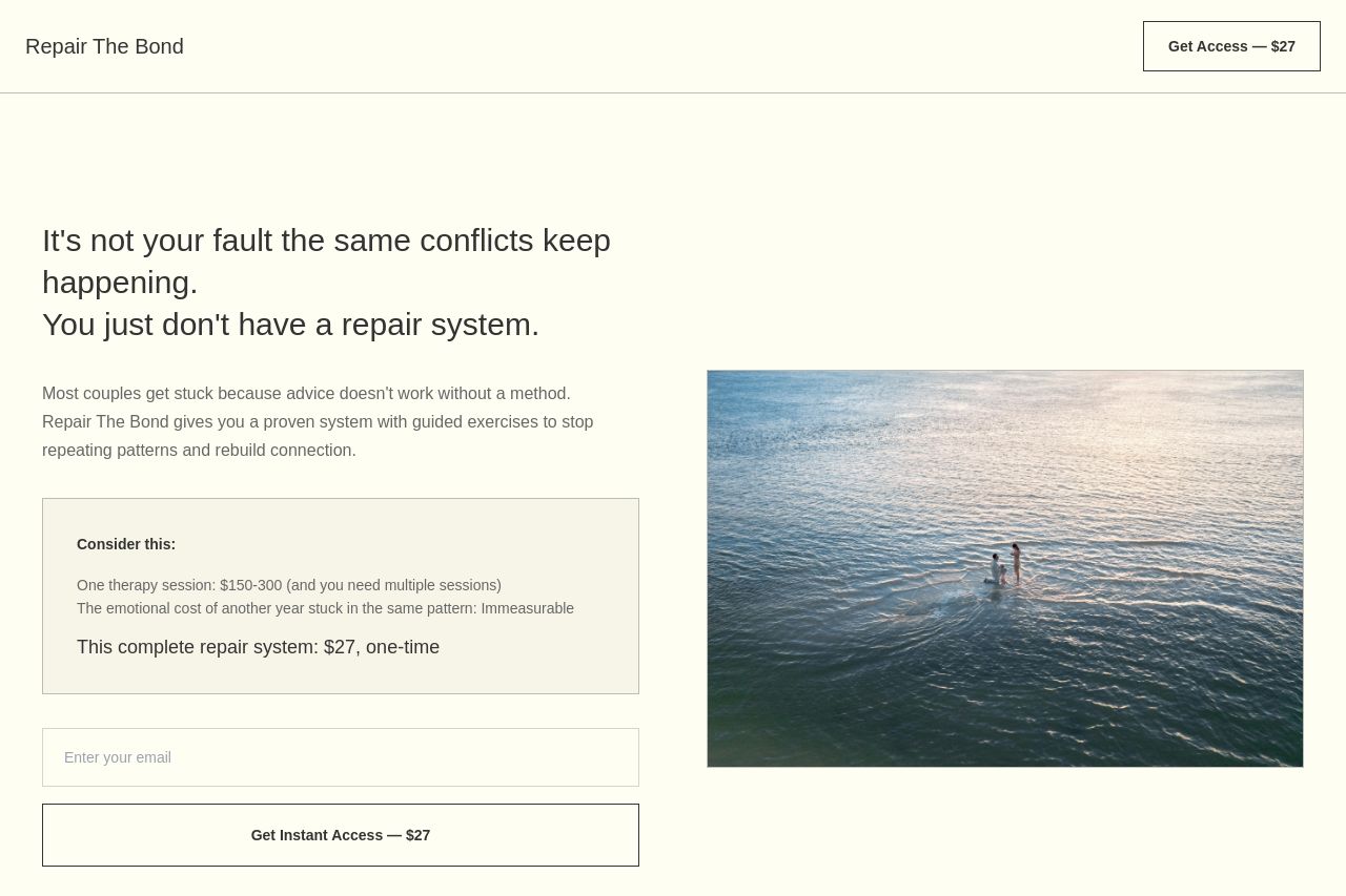
Rough around the edges, but not a total loss. The hero promises a ‘repair system’ for conflicts, but the main value proposition isn’t crystal clear, and the page buries the core benefit under a lot of soft, generic language. The visuals are pleasant, but there’s almost no social proof or credibility signals to back up the claim. Downstream sections repeat the same ideas with bland cards and FAQ toggles, which feels more like filler than a structured, decision-accelerating experience. The pricing is explicit, yet CTAs are scattered across the page (top right, inline, bottom), creating friction and decision fatigue. For a couple audience that needs quick clarity and proof, this site provides vibes more than conviction. If you want to move people from “nice to know” to “take action now,” you need sharper messaging, stronger trust signals, and a tighter, scannable layout that guides them to one clear path: pay, start, prove results.
Key risk areas: missing proof (no testimonials or case studies), unclear transformation (exactly what a ‘repair system’ delivers in 2–3 steps), and friction in the CTA funnel (too many CTAs, inconsistent placement). Also, the Open Graph data is unavailable, but since you asked to rely on on-page signals, I’m not counting that—just noting it won’t help if you share this page elsewhere.
actionable wins: tighten headlines, convert some of the long paragraphs into scannable bullets, consolidate CTAs, and drop a couple of social proofs right near the hero and pricing panel. Add a stronger guarantee and a risk-reversal element to close the sale.
- Clarify the core promise in the hero: replace the long, empathetic lines with a single crisp statement like: 'Stop arguing. Rebuild trust in 3 guided steps.' Add one concrete benefit per step (e.g., Identify patterns, Apply repair protocols, Rebuild connection).
- Move the primary CTA into a near-fold, single-CTA layout with a strong verb (e.g., Get Instant Access to the complete repair system). Remove redundant CTAs or clearly separate primary vs. secondary CTAs to avoid confusion.
- Add 2–3 real testimonials or quantified outcomes near the hero and pricing area. If you can’t show client names, use anonymized quotes with location and duration to boost legitimacy.