repairthebond.com
Landing Page Analysis
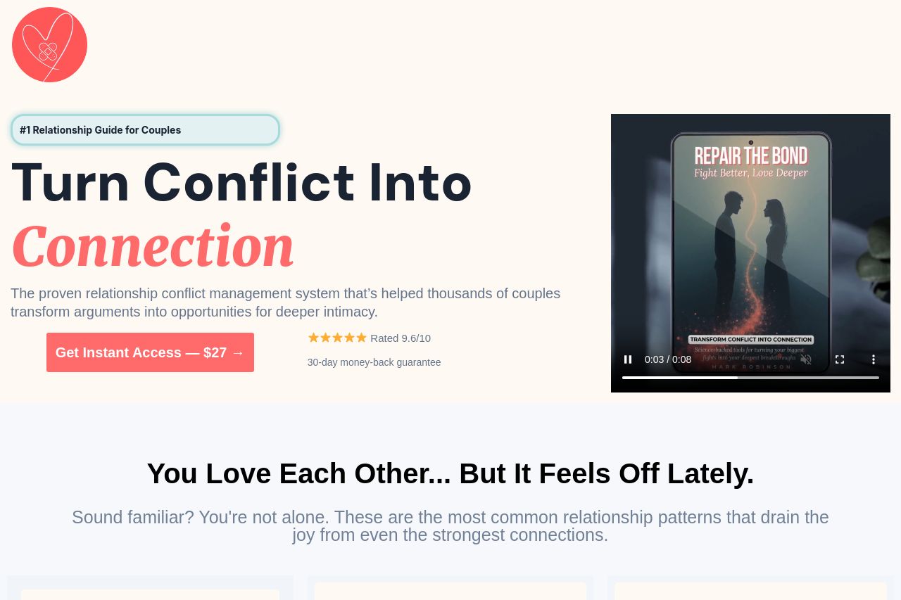
The proven relationship conflict management system that’s helped thousands of couples transform arguments into opportunities for deeper intimacy.
Summary:
Turn Conflict Into Connection sounds promising, but the page overdoes the shtick and underdelivers on clarity. the hero copy yells in bold and the price tag, but there’s zero quick, concrete explainers about what you actually get for $27. the two-column layout with a video mockup on the right looks nice, but it doesn’t build trust fast enough. after fold the page devolves into a sea of cards, testimonials, and FAQ-like blocks that feel more like a maze than a guided sales flow. the audience (couples in their late 20s to 40s) will skim and bounce if you don’t anchor benefits, outcomes, and risk reversal in the first screen. there are decent elements—a clear CTA, a marketable promise, and some social proof—but they’re buried behind too many sections, noisy visuals, and inconsistent typography. in short: the page has personality, but it’s not doing its job of quickly convincing a couple to buy. fix the clarity, cut the clutter, and stop treating the reader like a data point in a funnel.
- Rewrite the hero so the main benefit is crystal clear in one sentence (for example: 'learn simple, proven steps to turn daily conflicts into deeper intimacy in 20 minutes a day'). add 2-3 bullets that preview concrete outcomes.
- Explicitly define the target audience in the hero (e.g., 'for couples ages 25–45 who fight about communication, intimacy, and time together').
- Reduce CTA clutter: keep one primary above-the-fold CTA with a clear benefit, and move secondary CTAs further down or behind accordions. make the CTA visually dominant but not noisy.