ahrefs.com
Landing Page Analysis
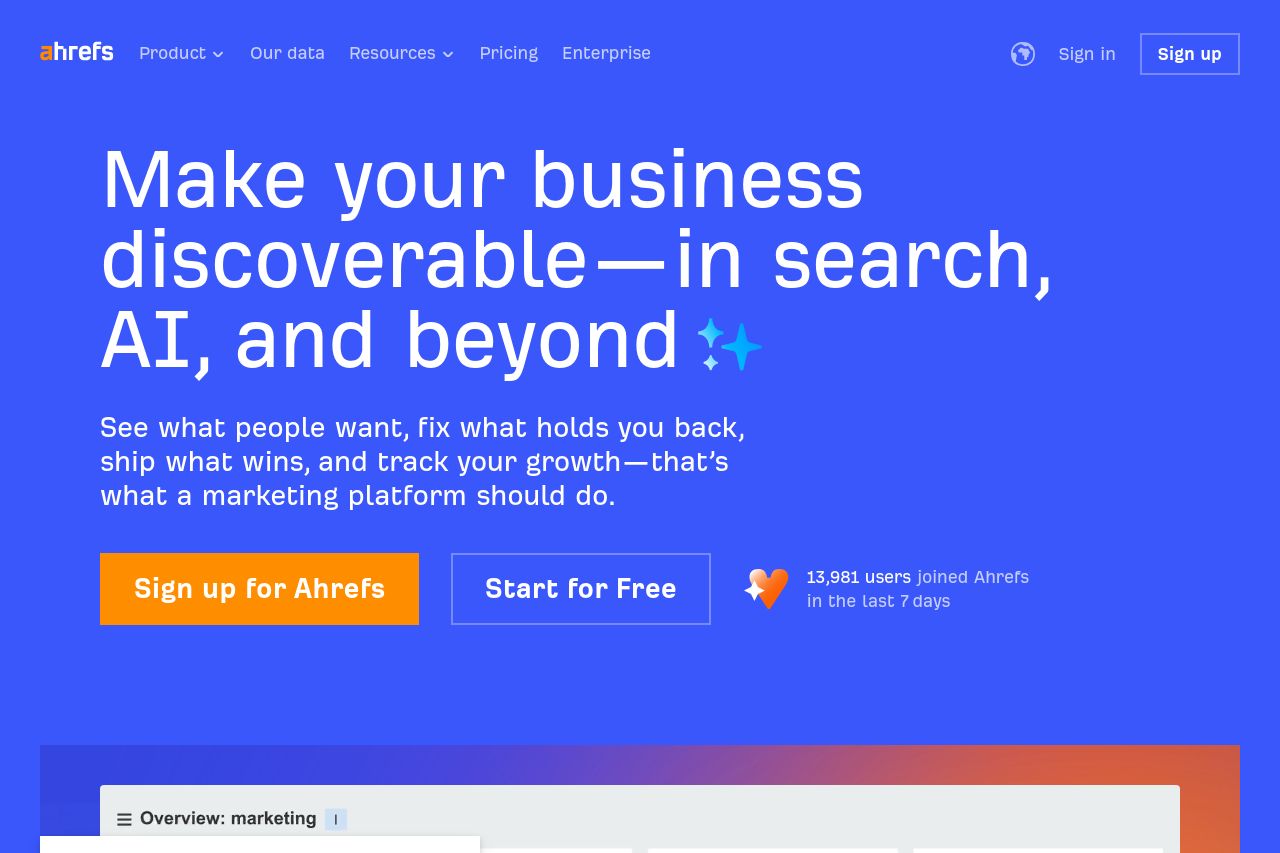
We help marketers drive visibility across AI search, SEO, content, and social – with the largest AI and search databases online.
Summary:
The OG data exist, but it’s bland and not tailored to a B2B SaaS founder audience. The title leans on “AI” and “Big Data” branding without a concrete benefit, which makes it forgettable in feeds. The description starts strong but ends up generic and long, risking truncation and losing focus on what the platform actually delivers. The image is just a logo on a flat blue field—it won’t stop thumbs or explain the product. In short: solid branding, zero punch or clarity about outcomes, and a lazy social image. If you want clicks, give social scrollers a reason to care in one glance.
Also, there’s a mismatch with the hero copy that emphasizes discoverability and growth; OG should echo that value prop, not reinvent the same buzzwords at social scale.
- Rewrite the OG title to be benefit-led and audience-specific (under ~60–70 characters). Example: 'Ahrefs: AI Marketing Platform to Grow SEO, Content, and AI Insights'.
- Revise the OG description to state a concrete outcome and the target audience (e.g., SaaS/enterprise marketers) with measurable results. Example: 'Drive more qualified traffic and faster wins with AI-powered analytics across search, content, and social—backed by the largest AI-enabled data set.'
- Create an OG image that communicates value (not just branding): 1200×630 with a gradient that matches Ahrefs, plus a short benefit line or a dashboard mockup and a subtle CTA; include alt text like 'Ahrefs AI marketing platform dashboard'.