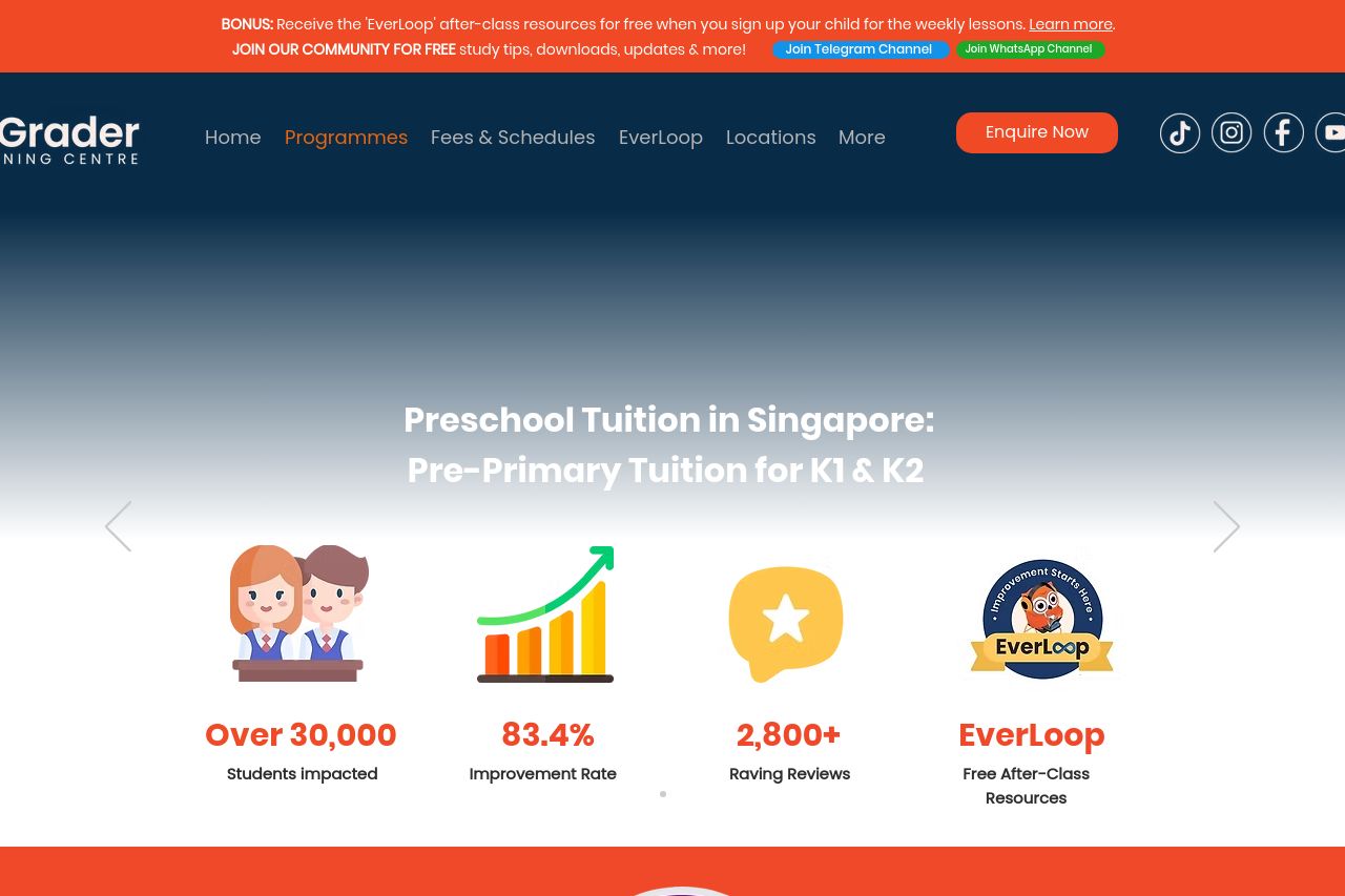
agrader.sg
Landing Page Analysis
Looking for quality pre-primary tuition for K1 & K2 in Singapore? AGrader provides expert tuition services to help your child get ahead. Enquire now!

Summary:
Open Graph data is present but boring in practice, which hurts social shares. The title includes the right signals (pre-primary, K1 & K2, location, and brand), but it’s a mouthful and not camera-ready for thumbnails on social feeds. The description is serviceable but generic, missing a punchy benefit or urgency. The attached image is just a logo on a peach background; that’s not going to stop thumbs from scrolling and certainly won’t communicate the curriculum or benefits at a glance. No obvious OG image size hints, cropping, or accessibility text are evident. In short: the OG setup is functional but uninspiring and could miss clicks because of weak visual and copy choices.
- Replace the OG image with a high-quality, engaging classroom or activity photo that clearly communicates K1/K2 English & Math in action (target size 1200x630; include a bold, readable overlay like 'Pre-Primary Tuition: English & Math' to boost click-through).
- Tighten the og:title to around 60-70 characters and sharpen the value proposition. Example: 'Pre-Primary Tuition for K1 & K2 in Singapore | AGrader' or 'K1 & K2 English & Math Tuition in Singapore – AGrader'.
- Add missing OG/Twitter meta tags (og:type, og:url, og:image:width, og:image:height, twitter:card) and ensure the description highlights a concrete benefit and a clear CTA (e.g., 'Enquire now to reserve a spot') to improve share appeal.