agrader.sg
Landing Page Analysis
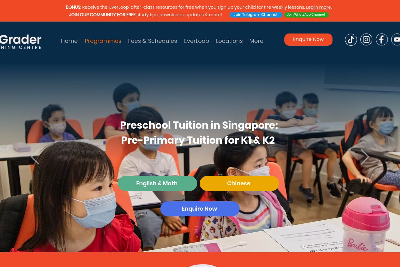
Looking for quality pre-primary tuition for K1 & K2 in Singapore? AGrader provides expert tuition services to help your child get ahead. Enquire now!
Summary:
The page is loud and visually busy, which grabs attention but wrecks clarity and trust at the first scroll. The hero looks polished and brand-aligned, but the main value proposition is buried under a heavy image and three different CTA buttons that fight for attention. Navigation is cluttered and there’s no clear, single path for parents to convert. The sections that follow try to cram in every feature, benefit, and product line, which makes the page feel more like a brochure than a funnel. You do get strong color contrast and a playful, kid-friendly vibe, but the abundance of saturated panels, mixed typography, and long explanatory blocks steal readability and slow down the decision-making process. The Open Graph data is separate from this critique, but it doesn’t help click-through; the OG image is a logo, not a context-setting photo, which hurts social performance. Overall, the page sells style over substance, gloss over crucial conversion cues, and leaves parents unsure about exactly what to do next beyond “Enquire Now.” Bold visuals, weak clarity, and inconsistent CTAs are the core frets here.**
- Simplify the hero: replace the three CTAs with a single primary CTA (Enquire Now) plus a small secondary option (View Curriculum) to reduce decision fatigue.
- Clarify the core value in 1–2 short lines above the fold (e.g., "K1 & K2 English & Math tuition that ensures readiness for Primary 1, with proven results").
- Use a single, high-contrast CTA placement strategy (one CTA in the hero, one after the main benefits, then a fixed footer CTA) to guide parents through a clear funnel.