rolloveryour401k.com
Landing Page Analysis
Understand the process of rolling over your 401k. Our guide offers tips, insights, and information on IRA accounts and beyond.
Summary:
Gut-check on the page in one breath
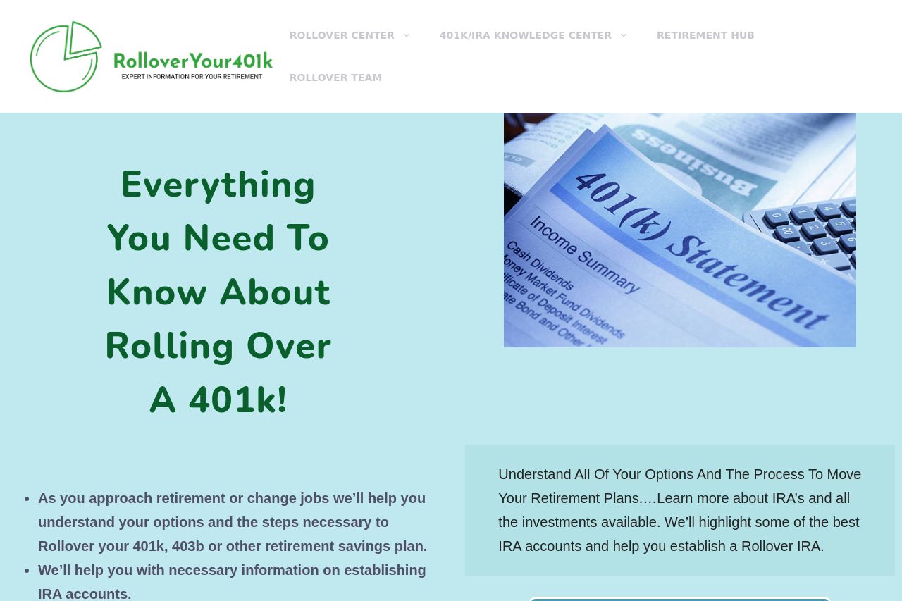
this site looks friendlier than most retirement-sites, and the hero headline is visually bold: “Everything You Need To Know About Rolling Over A 401k!” that actually communicates a clear topic. the nav is legible and the two-column hero layout is a decent pattern for scannability. but there are big, gnarly problems: a stray banner that screams “This site is available For Sale” wrecks trust, there’s no obvious proof of credibility, and the page suffers from too many CTAs fighting for attention. content density is high but the information isn’t structured into a crisp, guided path for someone in a hurry. the open graph metadata is generic at best, which hurts social click-through. overall it’s got potential, but the execution is noisy and trust-inhibiting in several places. you’re asking visitors to learn about 401k rollovers, but the page itself doesn’t clearly prove why they should believe or act now. improve the clarity, tighten proof, and fix the sale-banner parasite and you’ll stop bleeding conversions.
- Remove or replace the “This site is available For Sale” banner with a credible trust signal (privacy policy, contact, or a legitimate company statement).
- Sharpen the unique value proposition above the fold with a single, concrete benefit sentence (e.g., ‘Learn how to roll your 401(k) into an IRA with zero guesswork’).
- Add credible social proof (customer quotes, logos, or a short founder bio) and clear contact information in the header/footer to boost trust.