vp4.me
Landing Page Analysis
Summary:
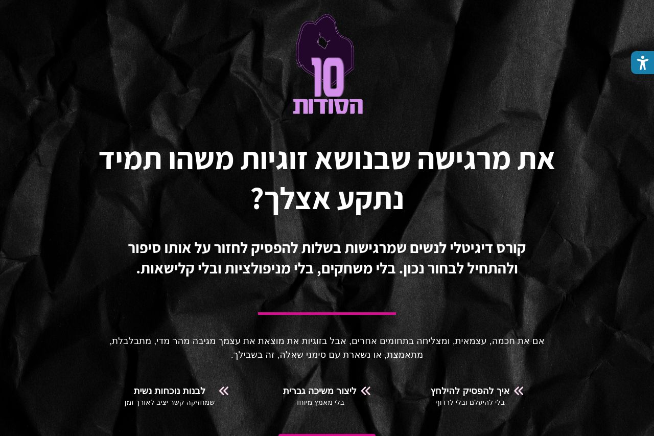
Messy, visually ambitious landing page for a “10 Secrets” course, but the execution is chaotic. The hero delivers a bold visual, but the core promise is buried in vague language and heavy, high-contrast backgrounds. The palette jumps from dark hero to white content to purple sections, creating jarring transitions and distracting from the message. CTAs exist, but there are multiple, conflicting prompts and inconsistent emphasis, which dilutes urgency. The content is long and not easily scannable, and there are serious gaps in credibility signals (trust badges, transparent contact, clear pricing details). Open Graph data is misconfigured, which will hurt social shares. Overall, it has brand potential, but it fails at clarity, consistency, and trust.
Open Graph feedback is included separately since you asked to focus on that data specifically in the Feedback section.
- Clear the core value proposition in the hero: write a single, crisp headline and subhead that state the outcome at a glance (e.g., “קורס עשרת הסודות לזוגיות בריאה – תלמדו איך להכיר, להתחייב ולהפשיץ קשרים טובים”).
- Unify the design system: pick one primary palette (one shade of purple/pink) and apply it consistently across hero, sections, and CTAs. Remove the busy background in the hero or optimize contrast for readability.
- Streamline content: reduce long blocks of Hebrew text in sections; convert benefits into 4–6 bullet points with icons; ensure CTAs are singular and clearly actionable with verbs (e.g., “הצטרפי עכשיו”).
- Boost credibility: add a real company/brand name, a visible contact method (email/phone), and a privacy policy. Include at least one testimonial with a verifiable source and a small logo or attribution.
- Fix Open Graph data and on-page accessibility: ensure OG title/description are present and descriptive, and set og:image to a properly cropped, high-resolution image.