tinylaunchpad.com
Landing Page Analysis
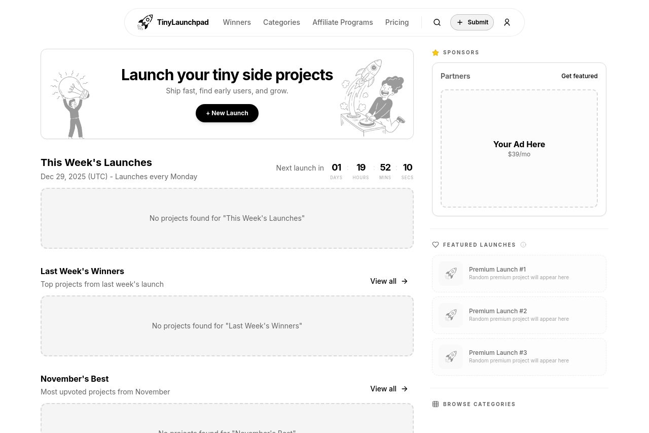
TinyLaunchpad is a platform to discover and upvote the best tech products. Find top products launching daily.
Summary:
Bold and flat, the page nails clean whitespace but it’s dead inside. The hero line promises a place to launch tiny side projects, but the actual value proposition is misaligned with the OG copy about discovering and upvoting the best tech products. Content is sparse: no live launches, no social proof, and the right rail ad space screams “monetize first, usefulness later.” The typography is legible, but the layout relies on placeholders (No projects found) that crush trust and curiosity. Navigation is present, but the overall momentum stalls because there’s nothing to explore beyond a header and a few empty cards. Improve by swapping vague copy for a crisp, differentiated promise, load real launches or compelling previews, and add credible signals to build trust fast. The Open Graph story should mirror the site’s actual value and be optimized for social shares, not rely on a hero screenshot alone.
- Fill the launches sections with real content or a strong teaser/preview (e.g., 3 spotlight launches, upcoming features, or a sign-up prompt) instead of empty placeholders.
- Rewrite the hero to clearly state the core value (e.g., "Discover and upvote the hottest tech launches daily" with a secondary benefit) and add a concrete subhead that explains how users benefit.
- Add trust signals (founder identity, contact, policies, testimonials/logos) and reduce reliance on ad space so the page feels credible and guideable.