replit.app
Landing Page Analysis
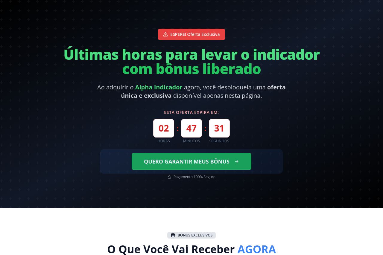
Ao adquirir o Alpha Indicador agora, você desbloqueia uma oferta única e exclusiva disponível apenas nesta página.
Summary:
This page lean-lands you into a shiny, high-contrast promo hiss-fest. The hero sells urgency and bonuses, but it never clearly states what the Alpha Indicator does or why anyone should care beyond a vague “bonuses.” The countdown, bold green CTA, and stacked bonuses do a good job of creating perceived value, but the copy doubles down on scarcity without delivering real clarity or proof. The pricing area cleverly hides actual price points (everything looks free as bonuses) but offers no transparent baseline for what you’d pay otherwise. The lower sections try to look credible with boxed features, yet there’s almost no social proof or organizational transparency. In short: strong conversion theater, weak foundations. The design is polished, but the messaging and credibility gaps will bite once users poke around. Action is clear (click the big green button), but the page risks skepticism without clearer benefits, risk disclosures, or customer validation.
Key issues: unclear core value proposition, insufficient audience specificity, missing trust signals, and too many buzzwords competing with actual benefits. Traders will want concrete use-cases, risk notes, and proof before parting with real money even if the offer is time-limited.
Big wins to keep: bold typography, solid CTA prominence, clean card layouts for the bonuses, and a clear clock that reinforces urgency. Big misses to fix: define the product’s real advantage in a single, repeatable line, add testimonials/logos, and present a transparent price path beyond “grátis.”
- Clarify the core value proposition in one sentence at the very top (e.g., "Alpha Indicator helps you spot high-probability trades in real time"). Repeat it near the CTA.
- Reduce the number of CTAs and ensure the primary CTA uses a single, verb-driven label. Replace multiple button styles with a single, unmistakable CTA style.
- Add credible social proof and trust signals (at minimum: a few customer quotes, a recognizable logo bar, and a short privacy/terms note). Consider a transparent pricing section or a clear statement about what’s included and what isn’t.