workspacenw.com
Landing Page Analysis
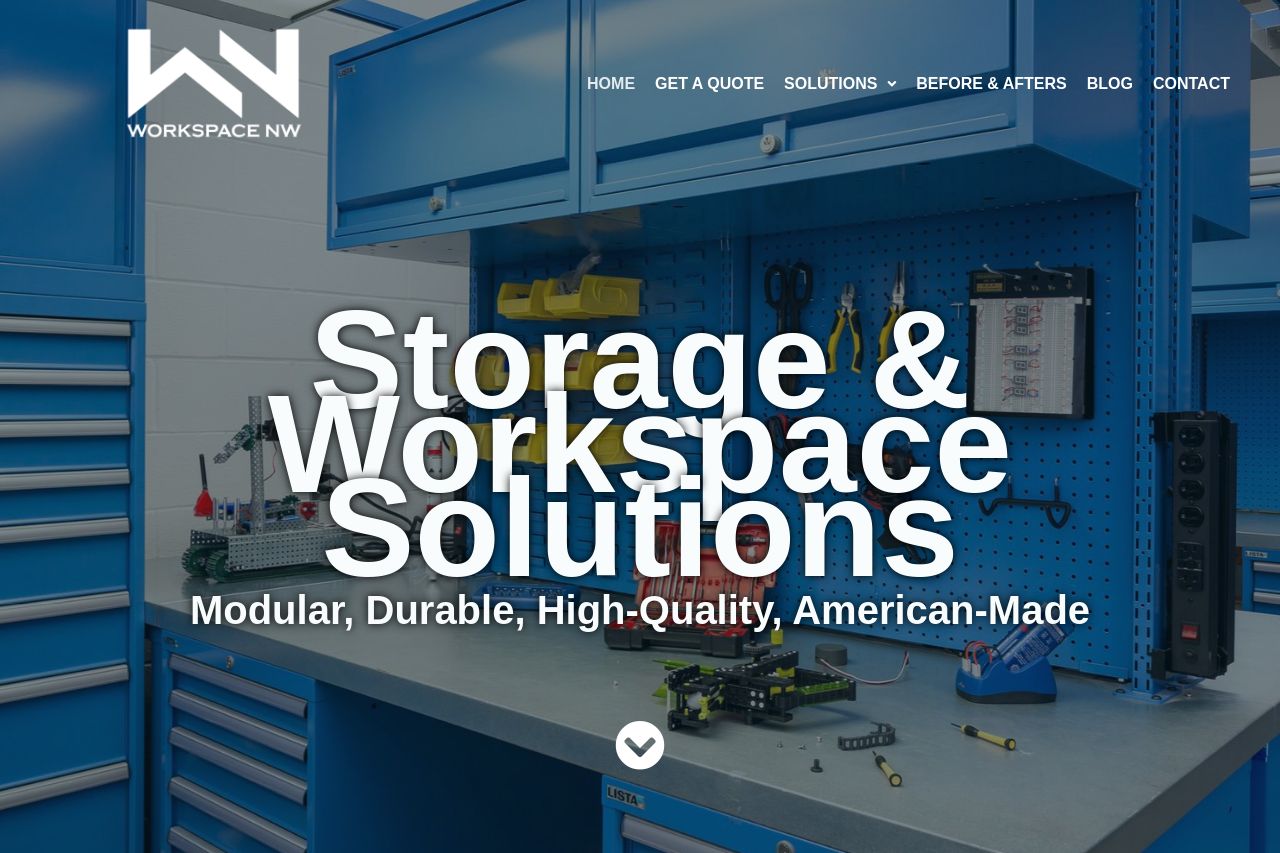
From warehouse racking and shelving to industrial cabinets or a workbench with drawers, Workspace NW has an American-made, steel modular solution for every need
Summary:
The hero looks big and cinematic, but it’s a mess in practice. The giant overlaid headline competes with a busy background and thin header navigation, which makes the core value proposition hard to grasp at a glance. Social proof is absent where it matters and the page veers between industrial-feel and corporate-brochure, so trust feels inconsistent. The Open Graph data (title/description/image) is a mismatch with the site and won’t do favors for click-throughs when shared. Overall, the page tries to be bold but ends up confusing the user journey and diluting the brand promise.
There are wins: a strong industry vibe, a visible CTA on some screens, and the color palette stays in the same family. But the execution is sloppy—sections feel disjointed, hierarchy is unclear, and accessibility/readability suffer from crowded typography and poor contrast in places. If you want to convert browsers into buyers, fix the storytelling, tighten the visual hierarchy, and align every social touchpoint with the actual product and audience.
Bottom line: good ambition, mediocre delivery. Fix the clarity first, then the trust signals, then the navigation flow. If you can’t read the hero without squinting, you’re already losing half your visitors.
- Shrink and clarify the hero headline so it immediately says what you sell (e.g., "Modular, American‑Made Storage & Workspace Solutions for Businesses"). Use a subtle background or a dark overlay to ensure readability. - Replace the OG image with a branded workspace photo or product shot that clearly represents Workspace NW; ensure OG title and description reflect the actual value proposition and a clear CTA (e.g., "Get a Free Quote for Modular Storage Solutions"). - Add social proof early on (customer logos, a short testimonial, or a trust badge) to boost credibility above the fold. - Create a clean, scannable navigation with distinct headings and a single prominent CTA (no more than two CTAs per screen). - Improve contrast and typography: limit to 2-3 font weights, use readable line lengths, and ensure headings have a clear hierarchy.