capbackcustoms.com
Landing Page Analysis
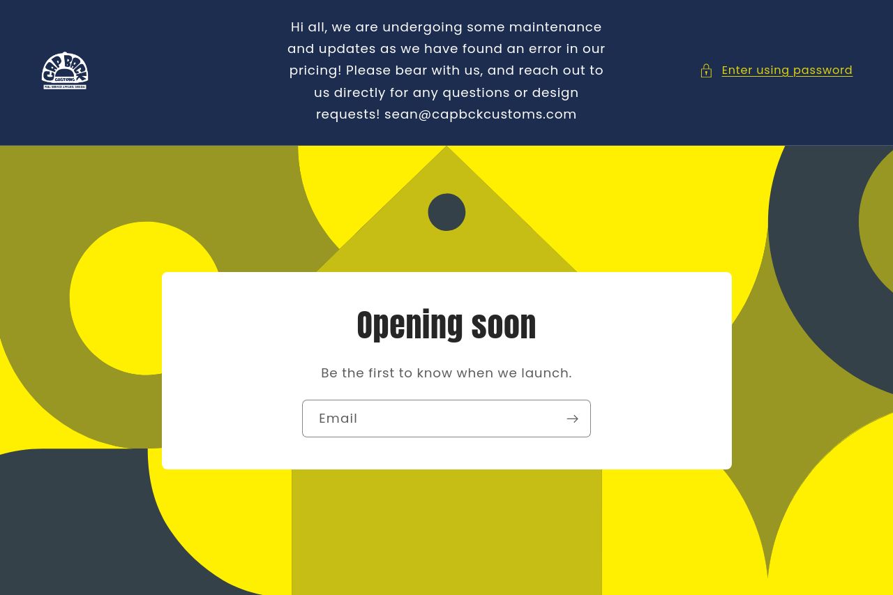
Be the first to know when we launch.
Summary:
This page is all promo-noise and zero substance. The hero is basically a logo on a bland tan backdrop with a math-less offer that screams “email gate first, ask questions later.” The big discount headline is clear, but there’s no clear why-this-brand-now value proposition: why should I care about Cap Back Customs beyond “we print hats”? The signup modal interrupting the browse kills the experience more than it helps. There’s almost zero trust signals (no testimonials, no proof of quality, no brand story), and the CTA options feel unfinished and confusing (Get 10% Off versus No, thanks). It looks like a distraction tactic dressed as a conversion tactic. In short: the page asks for trust before it earns it, and it fails miserably at giving a reason to convert beyond a discount. The result is a generic, visually dull experience that undercuts the brand and wastes the visitor’s time.
The Open Graph data you provided reinforces the problem: the title concatenates the brand name without a proper space, and the description is generic marketing boilerplate that doesn’t speak to the actual product or audience or offer a concrete action beyond a 10% discount. On social, you’re starting from square one instead of leveraging a compelling brand hook. The attached logo image is bold, but it’s not the kind of image that stops thumbs-scrolling on social feeds. You need a more product-shot or lifestyle image for social shares and a sharper OG description with a strong CTA.
- Fix the value proposition at the top of the page: state clearly who this is for and what problem you solve (e.g., “Custom hats for teams, brands, and events—design, production, and full service under one roof.”).
- Clarify audience and benefit: replace or augment the current copy with concrete use cases (e.g., “Branding for sports teams, music crews, businesses”).
- Remove or radically soften the intrusive signup gate. If you keep a signup, make it a secondary modal or inline form after a short hero section with a clear benefit and social proof.