calcora.org
Landing Page Analysis
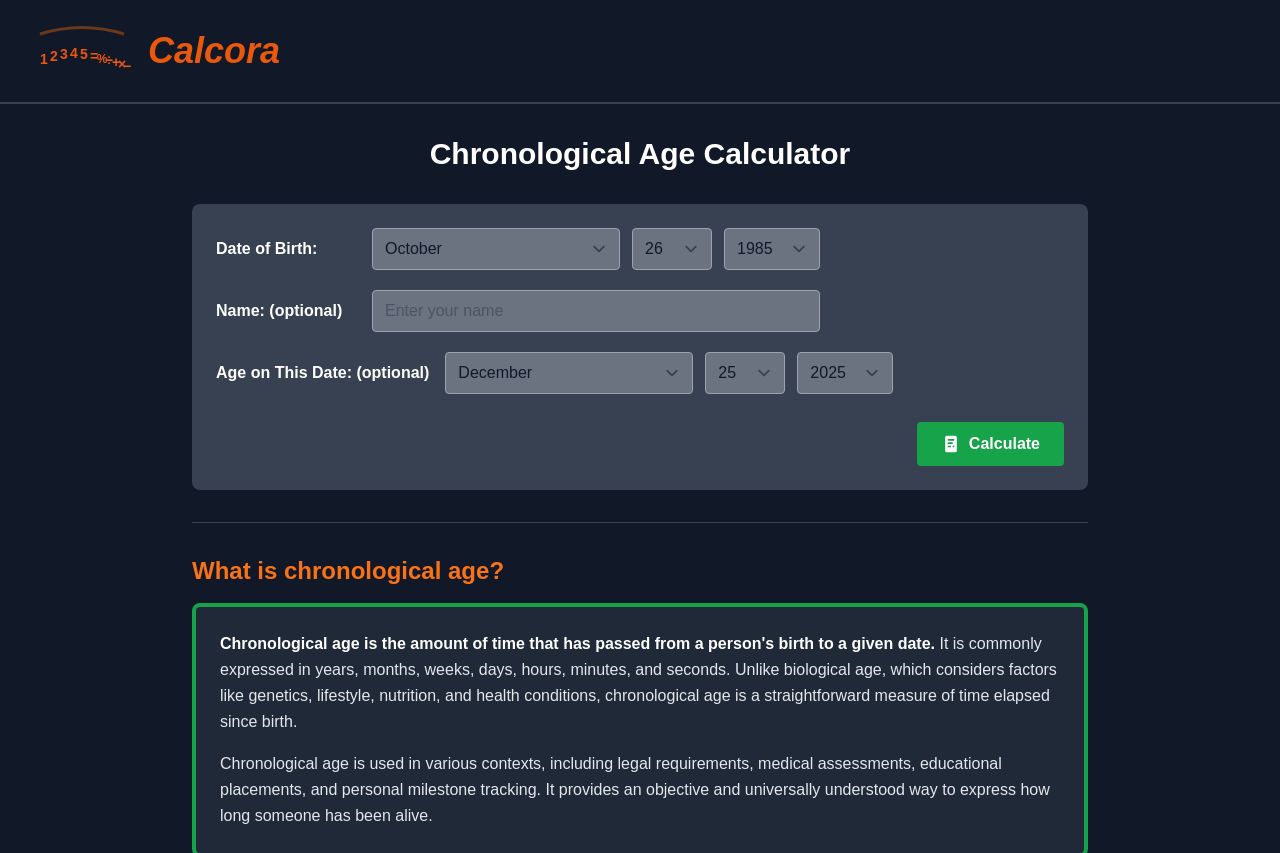
Calculate your chronological age based on your date of birth. Find out your age in years, months, days, hours, minutes, and seconds.
Summary:
Calcora’s Chronological Age Calculator page is technically usable, but a conversion nightmare in disguise. The hero area is clear about the feature name, but it offers almost zero guidance on what you’ll actually get or why you should care. The form is compact and familiar (birth date inputs + a single Calculate button), which is good for familiarity, but there’s no quick preview or example result to set user expectations. Below the fold, the content heavy sections try to educate users about “chronological age” but read more like a textbook than a persuasive onboarding experience. The visuals are coherent enough to navigate, yet there’s a noticeable lack of trust signals (no testimonials, logos, or case studies), and the cookie/privacy banner at the bottom feels intrusive after you start reading. In short: the page is functional and technically solid, but aggressively under-optimized for motivation, credibility, and skimmability.
If you want real impact, you need to stop burying the value in walls of text and start guiding users toward a concrete outcome with social proof, crystal-clear benefits, and a perception of professionalism that goes beyond a decent color palette and a green CTA.
- Clarify the value proposition in the hero: add a concise subhead like “Calculate exact chronological age in days, weeks, or years with leap-year handling” and show a quick example preview of the output.
- Add trust signals near the hero and in a dedicated credibility block (customer logos, short testimonials, or a brief “Calcora powered” statement with a link to a privacy policy).
- Break up the long-form sections into scannable bullets and short paragraphs; use more visible headings, pull-quotes, and a summary box at the top of each section to improve skimmability.