samarth.community
Landing Page Analysis
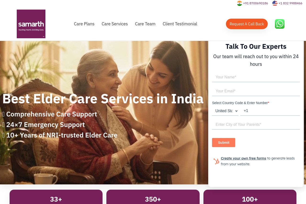
Trusted elder care services in India for NRI families in the USA: home nurses & attendants, 24×7 emergency support, post-op care, companion care, and more. Talk to our experts—Samarth serves 350+ citi
Summary:
A decent attempt at a US-NRI audience page, but it talks more about generic “best elder care” in India than about why USA families should trust this particular service for their parents back home. The hero headline is bold but bland, the value proposition isn’t sharply tailored to NRIs, and the right-side form (while visible) competes with the hero image for attention. There are credible elements (logos, trust blurbs, testimonials) but they’re buried behind carousels and long blocks, which drains scannability. Overall, it’s visually ambitious but emotionally underhung for the target audience; users will wonder what exactly sets Samarth apart for their family in the USA and India rather than just “care plans” and “trusted by” blurbs. Weaknesses to fix quickly: crystalize the NRIs-specific benefit, tighten the hero copy, improve form prominence and privacy cues, and declutter the page so the strongest proof points land sooner.
- Rewrite the hero value proposition to speak directly to USA NRIs (e.g., "We coordinate trusted elder care across 350+ Indian cities for your parents in India—so you sleep easy across the world."). Add a concise sub-hero line with concrete outcomes (emergency support, daily care, travel assistance).
- Bring the most persuasive proof above the fold: replace or compress carousels with a single, scannable grid of benefits and a bold, primary CTA like "Book Free Consultation" that’s visually distinct from the header.
- Make the right-hand contact form CTA more prominent and less competing with the hero. Consider moving it below the fold or giving it a persistent, sticky position on mobile. Add a privacy cue (no spam, data secured) and a short promise (e.g., "No spam, we’ll contact you within 24 hours").