championdisplays.net
Landing Page Analysis
Celebrate your league’s champion with a premium, personalized plaque with your league and season details and crafted as a permanent display of your season

Summary:
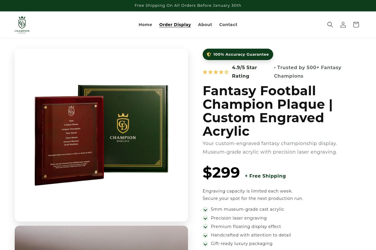
Hot take: premium visuals, heavy ambiguity. this page oozes luxury with big product photos and a bold headline, but the value proposition never lands cleanly in a single, scannable line. the right column copy gets overwhelmed by the 299 price, shipping perks, and a swarm of list bullets, while the left column shows pretty plaques that don’t clearly prove why a fantasy league champ needs this exact thing over a generic trophy. trust signals exist (4.9/5, trusted by 500+ champions) but they’re buried in a sea of tabs and sections. the result is a page that looks sophisticated while creating friction to actually buy: too many sections, inconsistent typography, and CTAs that fight for attention instead of guiding action. polish is there, but the UX kinks will kill conversions for time-crunched commissioners.**
OpenGraph data looks solid on the surface but lacks a visual hook since the image is inaccessible, and the description could use a sharper benefit-first angle to spark clicks.
- tighten the hero: cut copy length and present a crisp, benefit-driven value prop aimed at fantasy leagues (e.g., "A museum-grade, engraved plaque that forever remembers your league champion" ). span the solution in one line.
- simplify navigation: reduce the number of CTAs and sections that compete for attention; keep 1 primary CTA and a secondary supportive one at most.
- showcase proof higher in the fold: move a compact testimonial or trust badge next to the main CTA to boost credibility before the user scrolls down.