notta.ai
Landing Page Analysis
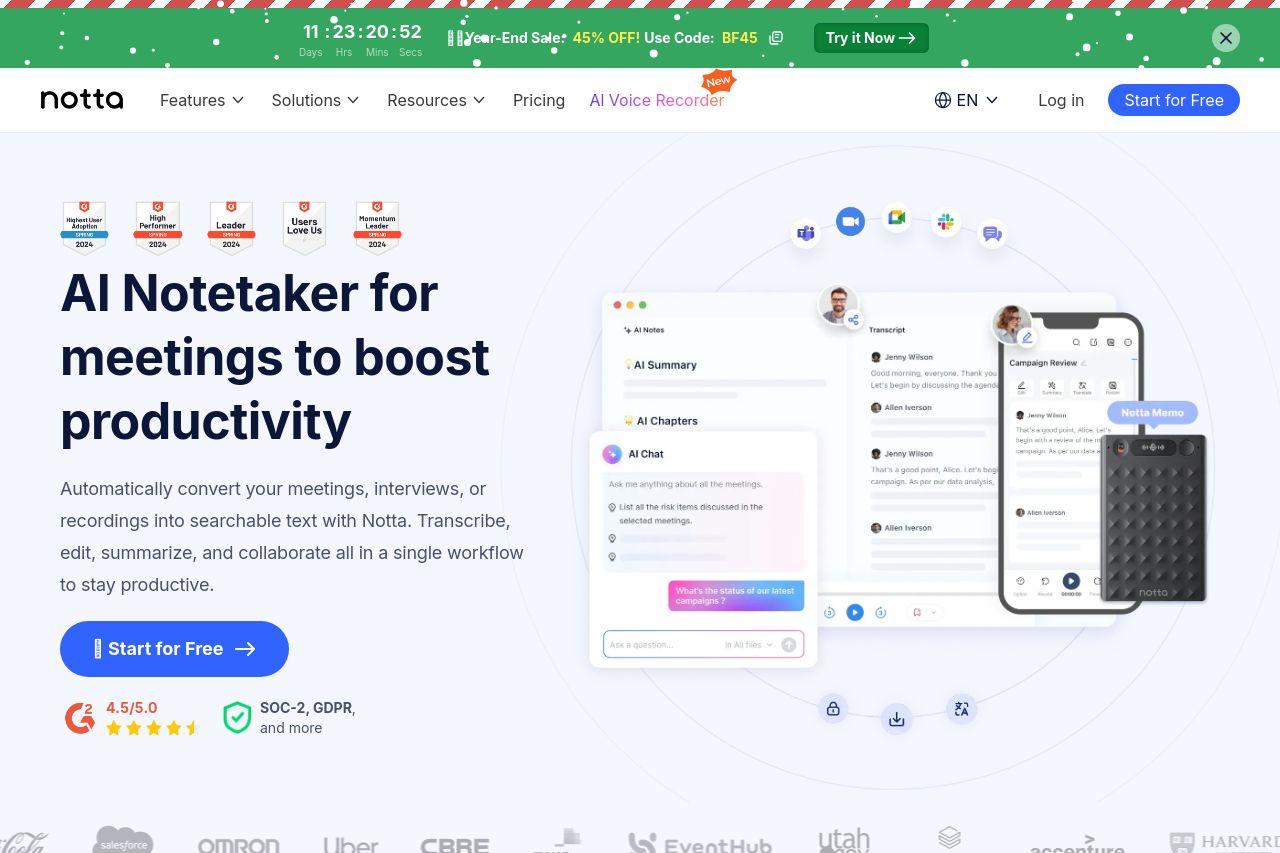
Automatically transcribe and summarize your meetings, interviews, or recordings into searchable text with Notta. Start for Free.
0
Share on:
Summary:
0
Messaging
0
Readability
0
Structure
0
Actionability
0
Design
0
Credibility
Open Graph feedback: the OG data you’ve got is decent but boringly generic. It leans on a standard “AI transcription” angle without a sharp, differentiating hook. The description is long and unfocused for social previews, which hurts click-through. The attached image appears strong, but without seeing the URL we can’t guarantee it crops well across platforms. Overall, this OG set misses a high-contrast value prop, a precise CTA cue, and branding consistency that would boost engagement when shared.
Main Recommendations:
- Shorten the OG title to a tighter, brand-centric line (around 60 characters): "Notta AI — Meeting Notes & Transcripts (Free)"
- Condense the OG description to a punchy benefit statement (about 110–140 characters): "Transcribe and summarize meetings into searchable notes with Notta. Start for Free."
- Use an OG image sized for social (1200x630) that clearly features the Notta brand, a visible benefit, and a focal CTA cue; ensure the image won’t crop awkwardly on mobile
- Add robust social tags: og:type website, og:url canonical URL, twitter:card summary_large_image, twitter:title, and twitter:description to improve Twitter share quality
- If possible, include a no-crop safe focal area in the image (logo on left, concise benefit text on the right) and avoid heavy UI screenshots that may read as generic graphics