co.in
Landing Page Analysis
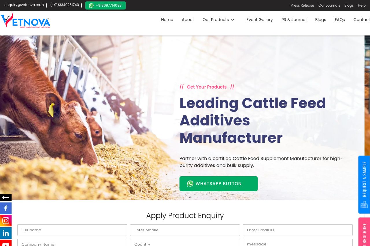
Vetnova is the dedicated Animal Feed Additives Manufacturer division of West Bengal Chemical Industries Ltd (WBCIL).
Summary:
Vetnova’s animal-feed site looks polished at first glance, but the B2B story is muddled and the UX drags you into a cacophony of visuals. The hero image is visually striking (a vivid aqua scene with fish) and the CTA is clear (a WhatsApp button), but the main value proposition reads as generic noise rather than a concrete, buyer-focused outcome. There’s a lot of content down the page, yet little evidence of real-world impact (no client case studies, no quantified benefits, no clear demo or pricing). The floating side bars and the heavy use of logos and accreditations help credibility—yet they also clutter the experience and threaten professionalism. The lower sections (Our Impact, Insights, Accreditations) show potential, but they don’t feel tightly integrated into a single, persuasive B2B narrative. The Open Graph data provided suggests a brand pedigree, but the image choice (team photo) and copy don’t align with a product- or outcome-driven social hook, risking weak click-through from social channels. Overall, strong assets exist, but the page needs a tighter, outcome-focused backbone, better clarity for buyers, and a cleaner UX rhythm.**
- Crystallize the primary value proposition with a tangible outcome (for example, "Improve feed efficiency by X% and reduce costs per unit of output—backed by case studies"), and repeat it near the top.
- Replace or supplement the hero image with a product/impact visual (e.g., a chart showing performance gains, or a feeding trial image) and tighten typography for readability with a short, benefit-driven subtitle.
- Add 1–2 concrete use cases or buyer-centric benefits (poultry, cattle, aquaculture segments) early on to boost audience alignment.
- Reduce visual noise by rethinking floating sidebars and by introducing a cleaner information hierarchy; ensure CTAs are consistently placed post-section and clearly labeled.
- Incorporate trust signals throughout the journey (brief client logos, a downloadable one-pager, or a short case study demo) and remove generic FAQ-like blocks from the fold to avoid distraction.