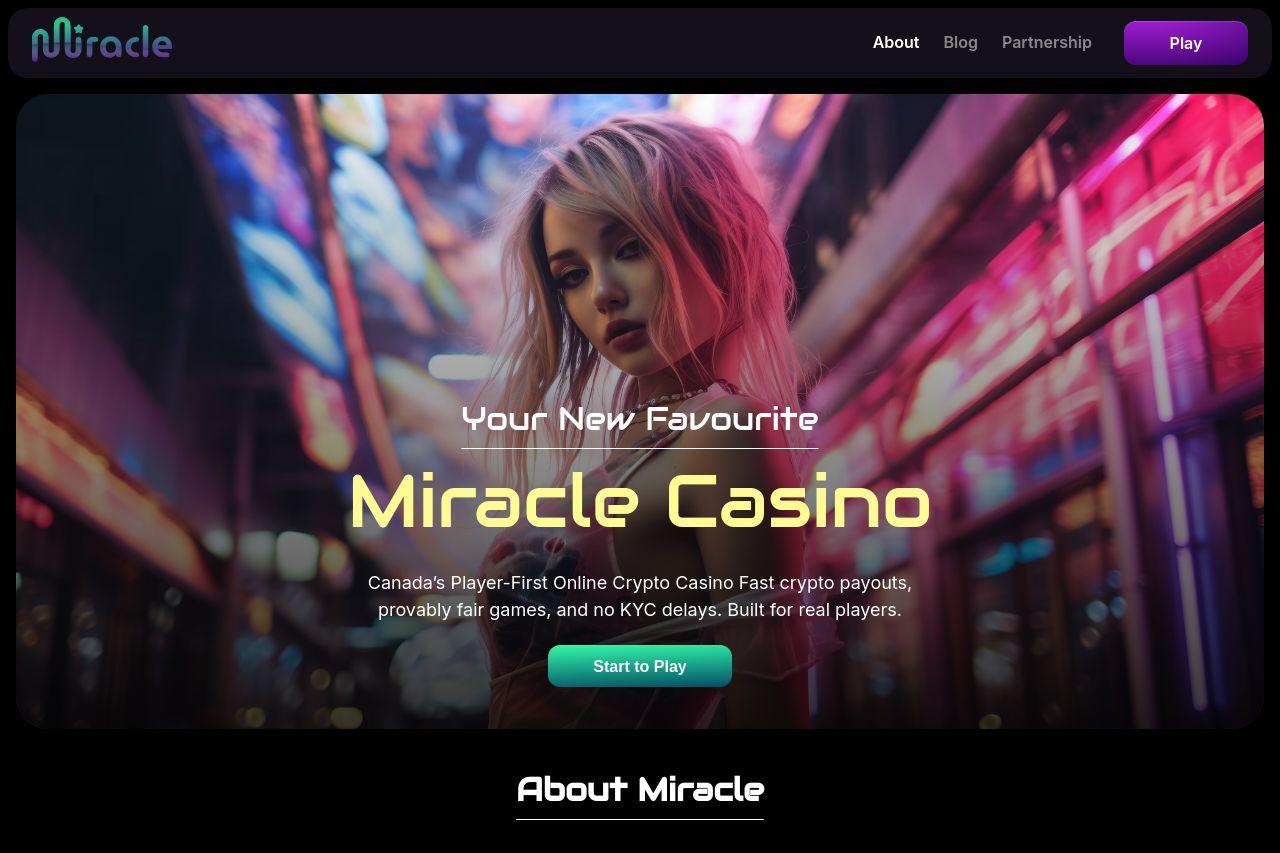
miracle.casino
Landing Page Analysis
Your luxury escape starts now. Discover a premium casino delivering miracle moments of luxury fun for those who demand excellence and relaxation.

Summary:
Bold, flashy, and loud enough to catch a skittish gambler’s eye, but all flash and no substance. Miracle Casino leans hard into luxury vibes, yet the core value it promises remains blurry. The hero copy reads visually impressive, but there’s no crisp, testable reason to choose Miracle over any other casino—no concrete benefits, no clear audience, and no early proof that this is trustworthy. Navigation feels heavy, with shadowy promises and no scannable path to a signup. Social proof is thin or tucked away, and the pricing/limits/demo options are not immediately visible, which kills initial trust and momentum. The design feels ambitious but inconsistent—typography, color, and spacing fight for attention rather than guiding the eye. Overall, it screams “premium experience” but delivers little you can anchor on or act upon in the first 5 seconds. You need sharper messaging, faster clarity, and a tangible path to sign-up or play. The OG data looks decent on the surface but should be tightly aligned with the on-page copy to maximize click-through from social.
What stands out in a good way is the commitment to a luxury brand voice; what drags it down is coherence, credibility, and a frictionless first-step offer. If you want real improvement, start with the basics: a crystal-clear value proposition, visible pricing/terms, robust trust signals, and a cohesive CTA framework that guides users from curiosity to action in under 6 seconds.
- Radically tighten the hero value proposition so it answers: what is Miracle Casino, who is it for, and why should they care in 1 sentence? Example direction: "Miracle Casino delivers premium, fast-paced online gaming with exclusive bonuses—built for discerning players who want luxury and reliability in one seamless experience."
- Make your main CTA explicit and single. Use a verb-led, benefit-focused CTA like "Play Now and Claim Your Luxury Bonus" or "Join Miracle for Elite Gaming" and place it after the hero headline and subhead. Remove competing CTAs in the hero area.
- Add a 3- to 4-point benefits list above the fold (no more than 5 bullets) that translates features into concrete outcomes (e.g., fast payouts, premium games, exclusive bonuses, top-tier security).
- Incorporate trust early: include a visible customer testimonial or a recognizable partner/logo row, plus a short guarantee or policy snippet (withdrawal times, responsible gaming) within the first screen.
- Audit typography and spacing to improve readability: reduce paragraph density in the hero, use one prominent font for headlines, another for body, and ensure sufficient contrast for accessibility.