thetawave.ai
Landing Page Analysis
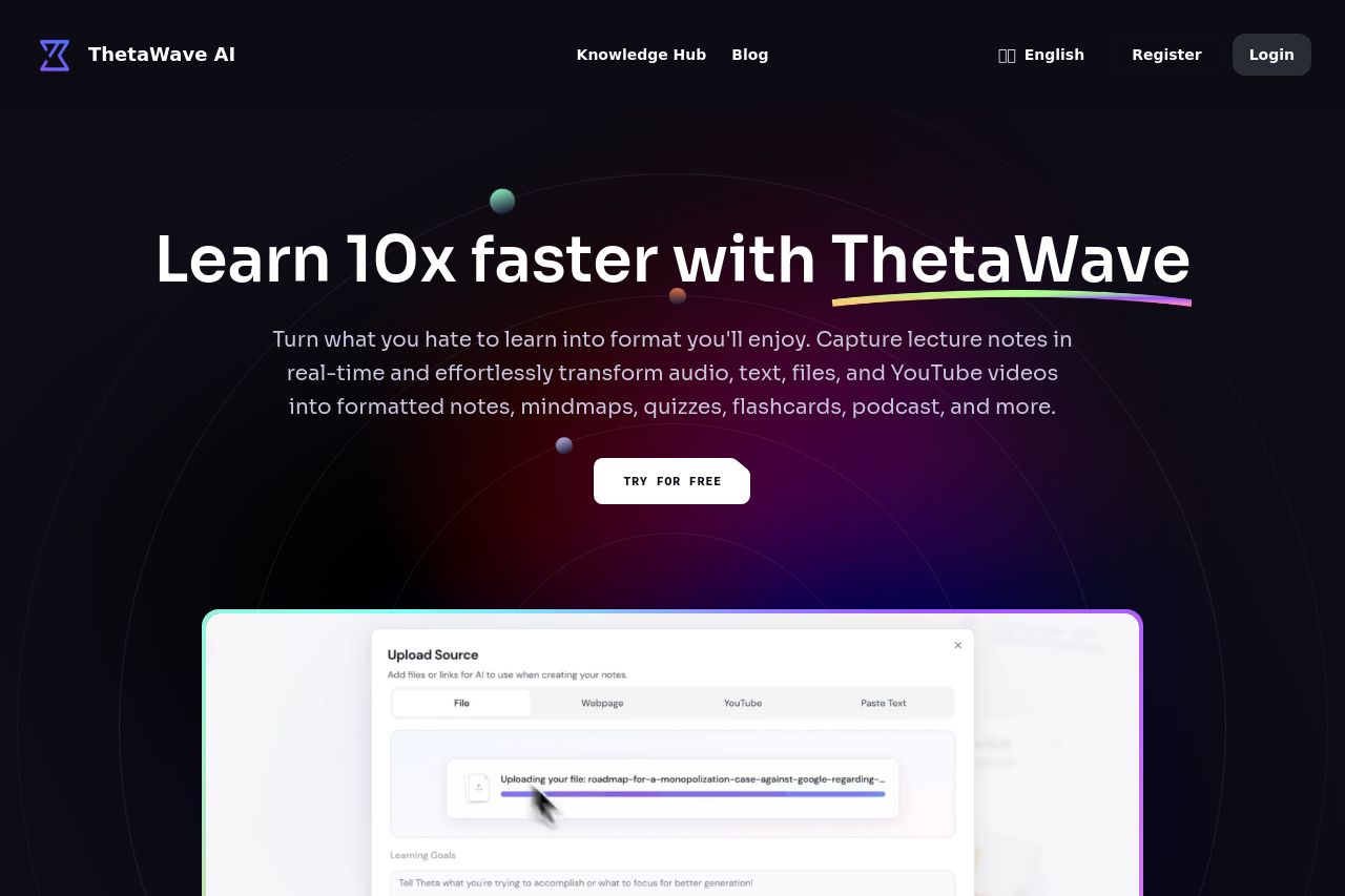
Never miss a word in lectures! Thetawave converts audio, text, files, and YouTube videos into beautifully formatted notes with customized levels of details. Learn faster from vast content and accelera
Summary:
This page looks premium, but the messaging isn’t as sharp for students as it could be. The hero headline is bold and memorable, but it doesn’t immediately answer what the product does for a student in a single glance. The subcopy tries to cover a lot (notes, mindmaps, quizzes, flashcards, podcasts) but it’s a wall of text that students will skim. The visual language is strong and the dark cosmos aesthetic is catchy, yet it risks overshadowing concrete benefits. Navigation is minimal, which helps aesthetics but hurts quick scannability for a busy student who wants to know “what’s in it for me?” The trust logos are nice social proof, but there’s no student-specific proof (grades, study outcomes, or sample notes). CTA is visible but generic; you’ll want a student-centric CTA like “Start Free Notes” or “Get My Study Kit” and multiple micro-conversions after each section. Overall, the page looks great but the student value proposition isn’t communicated with enough speed and clarity; it’s easy to miss the exact pain points and outcomes students care about. Bold visuals, but weak immediate clarity for the target audience.
- Make the main value proposition incredibly explicit for students in the first 3 lines (e.g., "Capture lectures and turn them into study-ready notes in real time—quizzes, flashcards, mindmaps included").
- Add a student-specific hook in the hero (e.g., feature a quick use-case or a short demo: "Watch your lecture notes auto-create in 60 seconds").
- Introduce clearer, student-focused CTAs after the hero and after key sections (e.g., "Try for Free—No credit card" with a contrasting button color) and include a visible sample preview or demo to reduce ambiguity.